Like every year in this period, the results of one of the most important photographic competitions in the world begin to flock: the Sony World Photography Awards 2020. The results of the National Awards have just come out, collecting the best shots for every nation in the world. In this piece we have selected a few and analyzed them for you
The Sony World Photography Awards 2020 are starting to produce the first interesting results. The results of the National Awards they collect have been published the best shots from over 60 different countries. Since the program opened eight years ago, over 400 National Award winners and finalists have been able to showcase their talent and beautiful images. For this piece we have selected some of the images of the winners and analyzed them from a technical and artistic point of view, because to learn how to photograph it is essential. learn to watch the work of professionals.
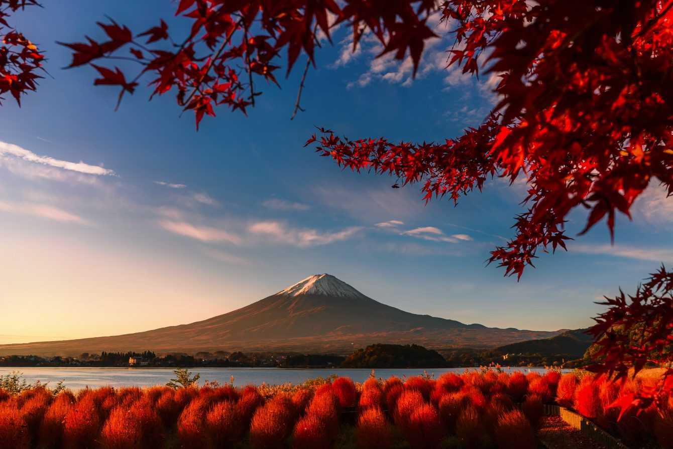
Copyright: © Kiatthaworn Khorthawornwong, Thailand, Winner, National Awards, 2020 Sony World Photography Awards
Mount Fuji has now been photographed on a thousand occasions, yet this masterpiece of nature still manages to amaze today. This shot portrays one of the most classic landscape situations: a mountain overlooking a lake at sunset. A “normal” subject, but embellished by some compositional choices that we lend ourselves to describe. First of all we note how the base of Mount Fuji is arranged on the first line of the thirds, giving a certain static to the image to the imposing figure of the mount itself. Lthe dynamic element in this case is given by the branches of maple that seem to tend towards the volcano following diagonal lines.
Another interesting element is the red frame around Mount Fuji created by the leaves and shrubs in the foreground. The use of these natural frames is very interesting: on the one hand it focuses the attention on the main subject, on the other hand it does not make the shot too heavy because it uses only elements not added artificially and therefore in harmony with everything else.
Copyright: © Abbas Alkhamis, Saudi Arabia, Winner, National Awards, 2020 Sony World Photography Awards
We selected this shot because its communicative strength struck us: it seems almost a clash between the wild nature represented by the horse and the man who tries to tame it. The dynamism of the image in fact revolves all around the couple man and beast, a contrast also accentuated by the almost opposite colors. However the instant also freezes a perfect symmetry between the two – positioned exactly along the vertical lines of the rule of thirds. A perfectly symmetrical clash, it is not known who will win.
Post production has produced a slightly “fluo” effect that we do not understand well. We might have appreciated a cruder post, perhaps in black and white. Perhaps we wanted to accentuate the gap between the background in which pastel shades prevail and the two subjects, but the final effect does not fully convince us.
Copyright: © Matheus Leite Ferreira, Brazil, Winner, National Awards, 2020 Sony World Photography Awards
A very powerful shot that seems to have been taken directly from a Sails Chong wedding shoot. This shot is not just an original and interesting composition, but tells a whole story made of suffering and friendship (see description) which, however, can be extended to the universal human condition: even in suffering men of different ethnic groups enter into brotherhood.
The choice of black and white is perfectly apt: it allows you to focus on the color contrasts of the subjects’ skin and above all on the expressions of their faces. The use of sheets has multiple functions. The first is the classic frame for focusing attention on the main subject, with the additional dynamic boost given by the diagonal lines. Going down more on an emotional level the sheets recall a strong idea of intimacy, enhancing the emotional thrust of the hug.
Copyright: © Liliana Ochoa, Colombia, Winner, National Awards, 2020 Sony World Photography Awards
Urban street photography has been telling the urban development of our cities and also their decay for years. This shot particularly struck us in its symmetry and wickedness: the workers suspended in the void almost seemed like aerial dancers or perhaps prisoners mockingly shown to the people in their suspended metal cages.
The subjects are distributed on four fairly symmetrical axes. This, despite the precarious condition of the workers, gives great stability to the composition. The dynamism of images can instead be traced back to 2 elements: the first is certainly the momentum from the bottom up given by the metal scaffolding, the second (perhaps for a good stroke of luck) is made by colors of workers’ uniforms which are very varied and make the gaze bounce from one side to the other. The crane, on the other hand, is almost a disturbing element, blocking the ascent to the top of the composition.
Copyright: © Tianhu Yuan, China, 1st Place, National Awards, 2020 Sony World Photography Awards
This shot could not fail to attract our attention. The composition is very simple, almost banal: a classic portrait set with two thirds of the image occupied vertically by the subject. So why is this shot striking? Meanwhile, it is recognized a background chromatic harmony based on pastel blue and pink colors. These colors are in contrast, but thanks to the desaturation everything appears much more in tune.
The girl’s mask is the strongest connection with surrealism, a suggestion that intrigues the observer, pushes him to look for an explanation. This effect is also accentuated by the contrast between the subject, dressed in a school uniform, and the setting, the riverbed of a big city. The whole shot remains suspended in a surreal dimension and this is precisely what captures us.
Copyright: © Jan Simon, Czech Republic, Winner, National Awards, 2020 Sony World Photography Awards
This shot, despite being of a naturalistic genre, has nothing to envy to the best portraits. Harmony is the communicative power of the shot is above average. The subject well isolated from the background thanks to a creamy bokeh that gives a lot of depth to the image. The main subject stands out, positioned in one of the critical points identified by the rule of thirds. But its expressiveness is the key point: the little monkey, small and gathered on its support, is overlooked by the environment and looks at it a little frightened and confused. Isn’t this a perfectly human feeling?
The use of color and light management are sublime: the green and brown hues blend in an atmosphere of mystery and depth, while a beam of light coming from the direction of the subject’s gaze illuminates it. A truly perfect shot, technically and artistically.
Copyright: © Esteban Montero, Ecuador, Winner, National Awards, 2020 Sony World Photography Awards
We conclude with a real portrait, so particular that it looks like a painting. The heavy touch of post production and composition give the image an almost artificial look, as if it was hand drawn with great care. Certainly an important element of the composition is lgrid that splits the image into squares: it is always dangerous to resort to such structures that heavily modify perception, highlighting details that might have previously been overshadowed. For example, it is the case of the light bulb or the painting of the cat on the girl’s lap, which, framed in this way, immediately catch the eye. Condensation is an important element in the composition: in fact, it makes the frames that contain disturbing elements negligible.
The shot works very well as a whole and the search in the different frames creates the right dynamism. We wonder what the same shot would have looked like with a tighter cut, for example by eliminating the grid under the main subject.
We have selected some of the shots that struck us personally at first glance, but of course all others are no less deserving. We refer you to the official National Awards gallery for a more in-depth look at all the winning shots: let us know your favorites! That’s all from the photography section, we hope to have helped you expand your love of photographic culture a little bit! Keep following us for many news and insights!
In the world of mobile gaming, Monopoly GO is a popular game known for being…
After the success of the first season, the animated series Monsters & Co Lavori in…
Xiaomi could launch a new cheap smartphone: Redmi 13. The first rumors speak of a…
The world of Formula 1 is always celebrated in every form of media possible. This…
Vivo expands the X100 family: X100 Ultra and X100s are coming, here are the first…
CORSAIR has further optimized the performance of PC fans with the RS MAX Series with…


