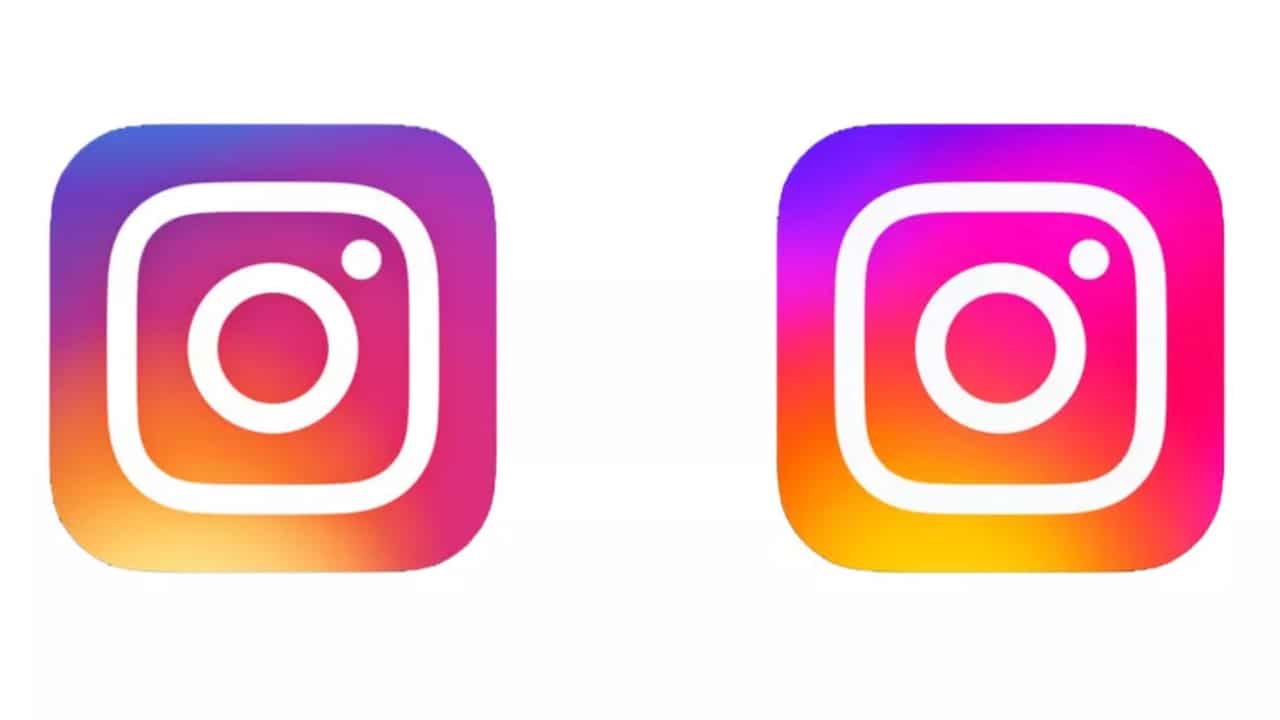
Il new instagram logo has aroused the most disparate reactions in users: someone felt hurt by the changes, someone appreciated them and someone else is still wondering what has really changed. On the other hand, just a few days ago the platform announced a new logo with a “reinvented gradient”. A small graphic quirk, which allows the logo to have the company’s official colors inside. But how have users reacted to the changes announced by the platform? Let’s go and find out together.
The evolution of the Instagram logo has been absolutely amazing. Originally the platform icon was distinguished by a vintage and monochromatic design, but then it was characterized by brighter colors than ever. The goal of the designers who took care of the logo remake, in fact, was to “bring more liveliness” and make it look “bright rather than one-dimensional”. Precisely for this, the new colorful gradient it is not limited to just the Instagram icon, but is incorporated into the overall theme of the App, including the Instagram Stories and the “Create” fashion. A fairly substantial change, which has triggered the most varied reactions.
On Twitter, for example, one user complained that the new logo was too saturated. Someone else, on the other hand, stated that too bright colors are annoying to the eye alone. And there were also those who openly stated that they hate the new logo. Yet, despite this, there are users who have appreciated the change of the Instagram logo, calling it “fresh and modern”. While a large portion of the public continues to declare that there are essentially no differences between the updated version and the previous one. Likewise, the launch of Instagram Sans has generated quite a few reactions among users.
Clearly, someone was quite disappointed with the changes to the Instagram font, so much so that they declared that they could no longer use the App after the update. While some have publicly expressed their appreciation for the new character of the platform, which seems to appeal especially to graphic designers. But that is not all. There is also a slice of the public that continues to judge these aesthetic changes as absolutely useless, so much so that they ask to optimize the experience on the platform rather than embellish it. In short, a change to the Instagram logo was enough to create chaos.
In the world of mobile gaming, Monopoly GO is a popular game known for being…
In view of the sixth F1 round of the season which will stop in the…
Different motivations but same objectives, score points. So let's find out where to watch Salernitana-AtalantaTelevision…
Let's discover QuiGioco together, a new platform in the great universe of online casinos and…
Amazon Prime Video releases for May 2024: here are the films, shows and TV series…
In this new episode of Anime Breakfast, this time a review, let's find out together…