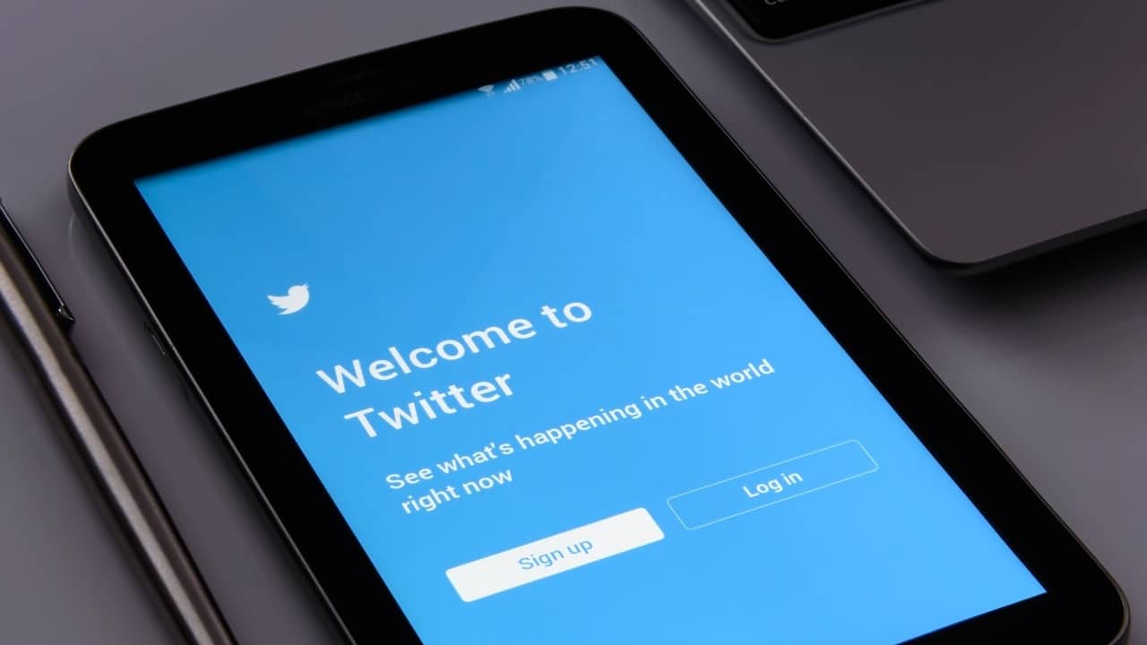
No great aesthetic or content revolution, but up Twitter a small and almost imperceptible modification of the was introduced today font. The platform font appears slightly thinner compared to the previous.
On mobile devices, however, the font seems to be the same as always, without substantial changes. The novelty has not been officially announced by the platform, but the debate is already open online to find the motivation behind this slight change.
Changing the font is certainly not something atypical for a social network, and it is probable that the choice derives from a simple aesthetic renewal factor. Despite this, several users on the net have advanced different hypotheses. What is suspicious is the fact that the company has not publicly announced the change.
According to some Twitter would have changed the font for limit fake accounts on the platform. With the old font, in fact, not the uppercase “i” (I) and the lowercase “L” (l) were almost identical. The same goes for the capital “o” (O) and the number 0. A feature exploited by various fake profiles to pretend to be actors and celebrities, using the two letters improperly.
The problem of fake accounts could be solved by implementing a functional verification system, but as we know Elon Musk has upset all plans in this regard. Meanwhile, Musk himself has changed his name on Twitter to call himself Mr. Tweet. A nice maneuver, which however had a particular implication: he now he can no longer change his username.
View all articles
In the world of mobile gaming, Monopoly GO is a popular game known for being…
In view of the sixth F1 round of the season which will stop in the…
Different motivations but same objectives, score points. So let's find out where to watch Salernitana-AtalantaTelevision…
Let's discover QuiGioco together, a new platform in the great universe of online casinos and…
Amazon Prime Video releases for May 2024: here are the films, shows and TV series…
In this new episode of Anime Breakfast, this time a review, let's find out together…

