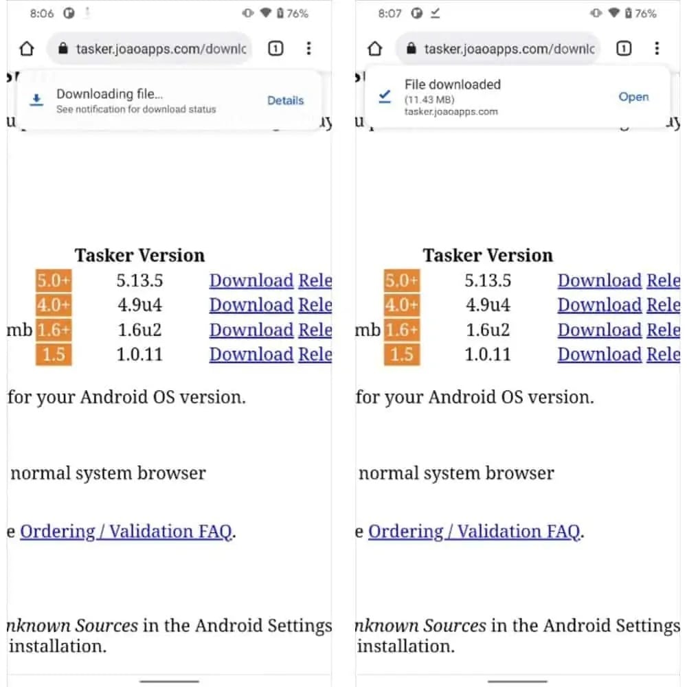
Google is considering redesigning the graphical interface of Chrome, to harmonize the section Bookmarks is that Download of your mobile browser with Android 12. In the “Canary” version of the browser, released to developers and testers, the first changes are already beginning to show.
Bookmarks and Downloads on Chrome fit Android 12
The first change concerns the Downloads, although perhaps an untrained eye may not notice it. In fact, the text and the style of the download pop-up remain practically unchanged. But instead of appearing at the bottom of the screen, compare in alto. It also appears in a separate pane from the Chrome tab, making it look more like one normal notification than to a browser message. This should align the vision to what we have seen for generic notifications on Android 12.

Even the graphic interface of the Bookmarks is renewed, perhaps in an even more evident way. In fact, instead of having a short list with the reduced versions of the icons, Google shows gods larger and easier to manage panes by touch for each single bookmark. Icons within a folder are also larger, making it easier to identify pages as well as manage actions.
At the time of writing this article, the changes are only part of the version 95 of Chrome Canary. This update channel receives the latest versions of the software for those who develop and want to test the news as soon as they are available. Before they arrive on a stable version of Chrome, we should wait at least mid-October. That way it would be ready for the arrival of Android 12, which we should see for the first time officially on the Pixel 6, arriving in mid-September.
We just have to wait to test these new features. Although perhaps we will pay less attention to it, in the midst of all the news to try in Android 12.


Leave a Reply
View Comments