What’s new for i Facebook groups, which could end up having an interface very similar to that of Discord. In fact, these days Meta is testing one new sidebar aligned left and a new channel list for groups, which is quite familiar to most of us. Indeed, by adding a purple hue in the layout the reference to Discord is almost obvious. But let’s find out what our groups will look like in the coming weeks.
Facebook groups: all the news coming soon
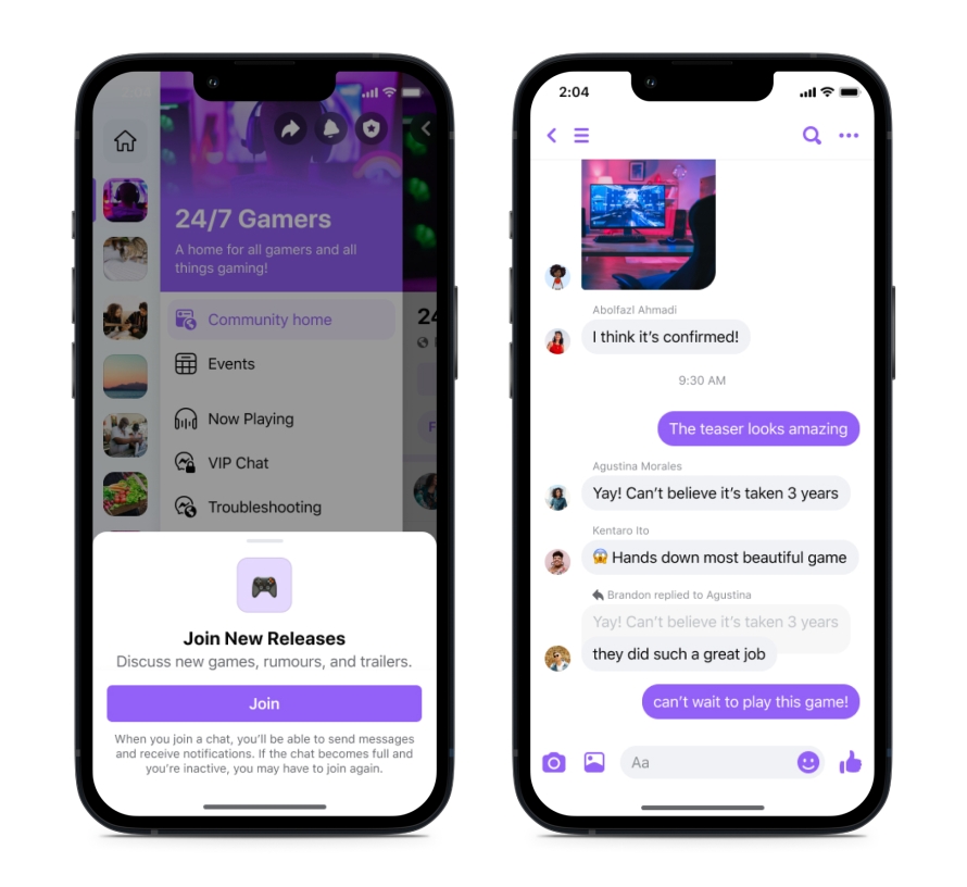
After a long time, Facebook has finally decided to update its Groups interface. Among the more interesting changes is a new sidebar that lists groups with rounded square icons, allowing users to choose which ones place in the foreground – just like on Discord and Slack -. Each individual group, then, has its own menu that contains channels, Messenger conversations and events.
 Credits: Meta
As for channels, these contain text chats, audio rooms or Feed rooms where people can post and comment in a way very similar to what you are used to in your Facebook Feed. In particular, the text chats will look a lot like a Messenger thread, while the audio rooms will remember in all respects those of Discord. In short, a series of fairly substantial changes, which come when Meta has chosen to make its platforms more and more similar to TikTok.
The company’s goal, in fact, is to create a Feed that recommends more content from accounts that are not followed by users. In this sense, revising the design of Facebook Groups can also prove useful to the cause. But it also remains to be seen how users will approach all these new features. We are then waiting to find out.











Leave a Reply
View Comments