And more powerful processor, an even more refined design, a lot of work on the camera software. And above all, a higher starting price. After this review we have no doubts: Nothing Phone (2) takes another category compared to Carl Pei’s company’s first smartphone, which was launched just last year.
In some areas, the difference is felt. But with a price that is close to the top of the range (or at least the least expensive version of the various top of the range) it manages to emerge and shed light with its Glyphs? Is it worth spending a little more on this second generation? And what are the differences compared to the first model? We try to answer all these questions in our Nothing Phone review (2).
Our review of Nothing Phone (2)
Nothing comes back with a new smartphone looking to improve the device without “distorting it“. Caparezza said that “the second album is always more difficult in an artist’s career”, because the surprise disappears and you have to confirm your qualities, smoothing out the defects. Nothing succeeded quite well with the Ear (2), although even then it had to increase the price. But with smartphones, the wiggle room seems less: the competition is truly enormous.
Of course, the company wanted to double down on the attention to detail. Already from the packaging, which this year you can recycle in its entirety: no plastic, all cardboard decorated in the same style as the Phone (2). And Nothing has brought some of this style even in the USB-C charging cable, with transparent ports.
A more refined design, in the details
The attention to detail it does not stop at the packaging, but continues with the product design. As we also told you in our first impressions of the device, Nothing has decided to keep the “concept” of the first smartphone. A large screen with narrow and symmetrical borders, metal frames all around (very reminiscent of the Cupertino style) and a transparent back which shows some components and above all i Glyph that light up. But she has refined some details to make your Phone (2) ready to compete with another range of smartphones.
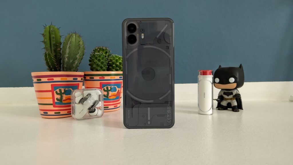
The profile of the smartphone, made in 100% recycled aluminum, it has an elegant and pleasant to the touch finish, really well done. We find the power and lock button on the right, while the two volume buttons are on the left: both click confidently and give good feedback. At the bottom we find the SIM slot and the USB-C input, as well as one of the two stereo speakers (the other is located in the upper edge, above the screen).
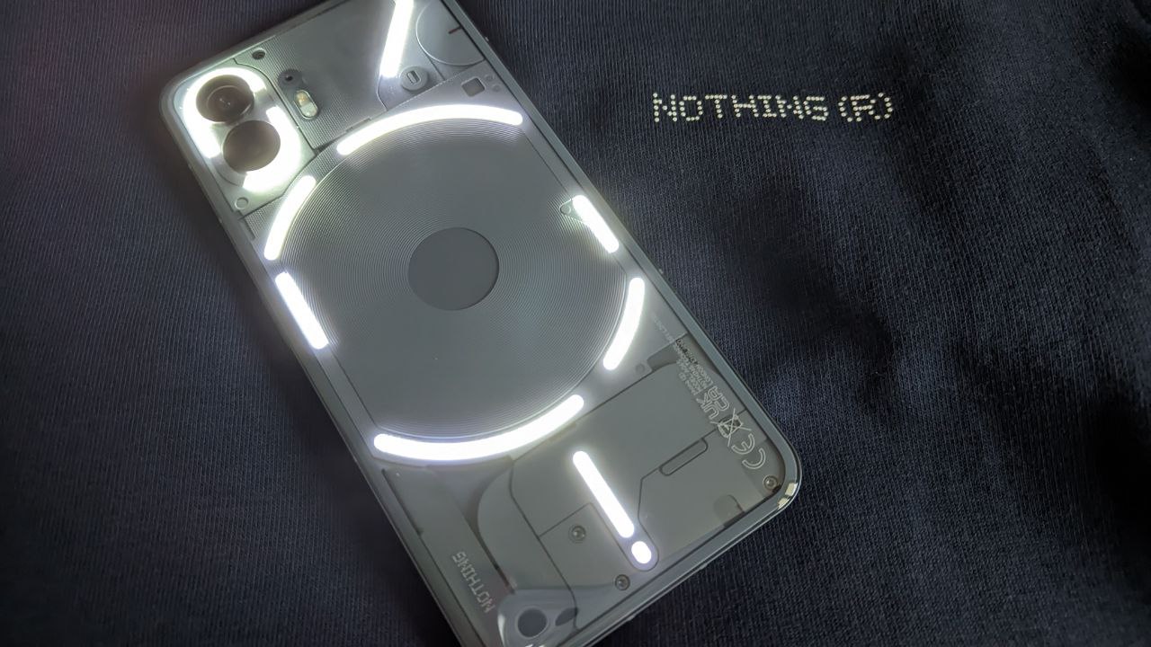
Also this year the back is the protagonist, with the rear glass which however in Nothing Phone (2) is slightly rounded on the sides. This makes the device is easier to handle, which, although wide and tall, fits comfortably in the hand. Nothing has reduced the spaces between the various components on the back, but the charm of a transparent back remains, which makes us guess the components inside. He also decided to “break” the Glyph lines, the luminous LEDs on the back of the smartphone, in order to be able to better exploit them for notifications and intelligent functions (we will learn more in the section dedicated to the software).
Buy it with Amazon Prime and discover all the advantages
Size remains important: 162.1 mm high, 76.4 mm wide and 8.6 mm thick. But by now we expect similar measures from almost all smartphones in this range, with few (but welcome) exceptions. The weight of 201.2 grams it is slightly higher than that of Phone (1), but it seems to us that Nothing has worked very well on the design to make it more comfortable to hold in the hands. It also improves water and dust resistance, with a IP54.
In design, it did everything a good sequel should do: it improved without distorting a concept that we already liked very much.
Nothing Phone Review (2): A great looking screen
The screen of Nothing Phone (2) increases in size from last year to a good 6.7 inches for this display which pleasantly impressed us during this review. The screen OLED has perfect contrast and really good 10-bit color. The resolution from 2412×1080, for a density of 394 ppi, it makes watching videos and TV series a real pleasure on your Phone (2).
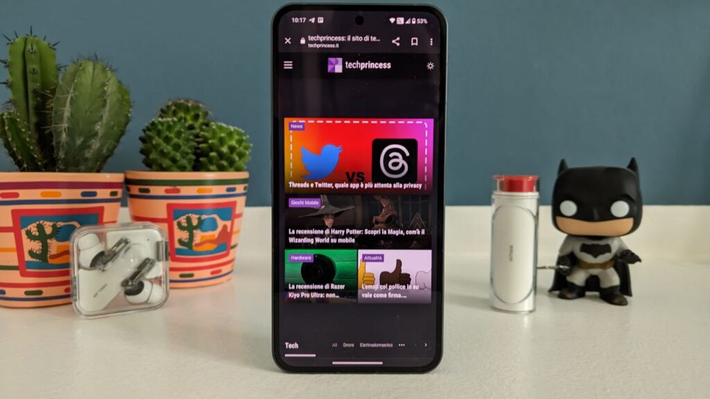
Compared to last year, the display LTPO allows you to vary the refresh rate from 1 to 120Hz automatically (last year it ranged from 60 to 120 Hz). This, as we will see, has a decidedly positive impact on the battery.
It looks great too brightness at 1000 nits, with peaks in HDR from 1600 nits. Even looking at the smartphone under the too hot sun of this summer, we can distinguish the menus and applications. Watching TV series in direct light isn’t optimal, but that goes for any backlit screen in the world.
Il touch sampling da 240Hz it is not the highest in circulation, but it allows even the most avid gamers to play without problems. On the screen we also find the fingerprint sensor, really excellent: once your fingers have “memorized” the position, you will unlock the smartphone in an instant (there is also unlocking with facial recognition). The Corning Gorilla Glass screen should ensure good scratch resistance.
Also in this category Nothing started from a good level with the Phone (1), but it has improved brightness and above all refresh rate, lengthening the battery.
A top-of-the-range processor, but not of the latest generation
Another big change concerns the processor. Last year Nothing had focused on a Snapdragon 778G +, a processor for the mid-range. A choice he appreciated, because except for professional mobile gamers, modern smartphone processors are able to cover practically every activity you can imagine without too many problems.
This year, however, Nothing wanted to bet on Snapdragon 8+ Gen 1. A top of the line chip. Although the first smartphones with the second generation of the chip have already arrived this year, the version chosen by Nothing doesn’t come too far from those peaks in the benchmarks. In daily use, you will hardly notice any differences with the other top of the range.
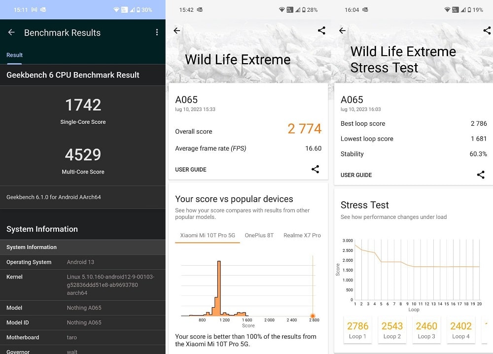
Nothing assicura 80% better performance than Phone (1). But on the “pure” power it becomes difficult to get a precise idea. Of course, the Nothing Phone (2) never experienced any slowdowns during the tests of this review and only warmed up during the stress tests – but in everyday use, the smartphone manages everything without heating up. Our version from 12GB di RAM e 256GB of memory (there are also a version from 8+128GB e 12+512GB) has always worked at best without any problems.
However, we were positively surprised by the energy management, which contributed greatly to the excellent performance of the battery.
Nothing OS 2.0 and Glyph, lots of customization (but some hitches)
The software also contributes to the positive performance, with the new operating system Nothing OS 2.0. Based on Android 13 and ready to update as soon as Google makes it available, the operating system remains very close to the “stock” one. You can also choose to opt out of many of the customizations Nothing, aiming for a more Pixel-like look. But that would be a pity: Nothing has worked well on custom icons for apps and for system colors and style, with really tasteful monochrome apps. We also really like the widget minimalist that you can use to make your home even more functional.
Nothing has taken an approach we espouse for managing Android. Few more apps (like Nothing X to manage devices like Ear headphones) and flexible customization. However, we found some uncertainties. Like the fact that some apps (like Outlook) have logged out automatically after a while they didn’t use them, forcing us to log in again. We think they are small bugs that Nothing will solve with the first official update (in the trial period before the smartphone software is released, it often has small stability problems). But we felt it was fair to report this issue – the only one we’ve had.
Buy it with Amazon Prime and discover all the advantages
We also emphasize that Nothing ensures three Android updates (up to Android 16, if it will be called that) and four years of security patches bimonthly.
I Glyph
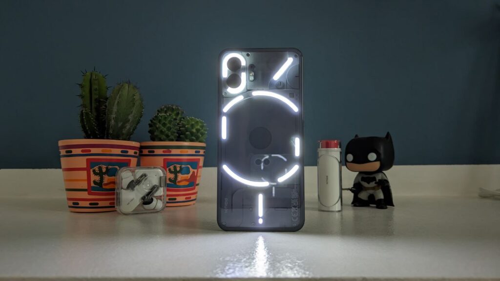
Last year Nothing made headlines with its Phone for several reasons. But above all for a bright novelty: i Glyph LED on the back of the smartphone. It was the function that turned the smartphone into a conversation piece, the one that everyone wanted to try. With Nothing Phone (2), the company wanted to bring several novelties to its most striking feature. Starting with the design.
While the LED “path” around the back is pretty similar to last year, Nothing has ‘broken’ Glyph lines. Which have become two around the cameras instead of just one, well you are in the center instead of just one. This allows greater control of the Glyphs, which have several more features.
first of all, notifications are better handled. You can’t yet customize the patterns for every application or contact, but you can specify certain apps that will have some persistent notifications. We have put Telegram and WhatsApp messages in this category, which we tend to respond to more urgently than emails or social media notifications. The convenient function remains “Flip to Glyph”: if you turn the smartphone, it enters…





Leave a Reply
View Comments