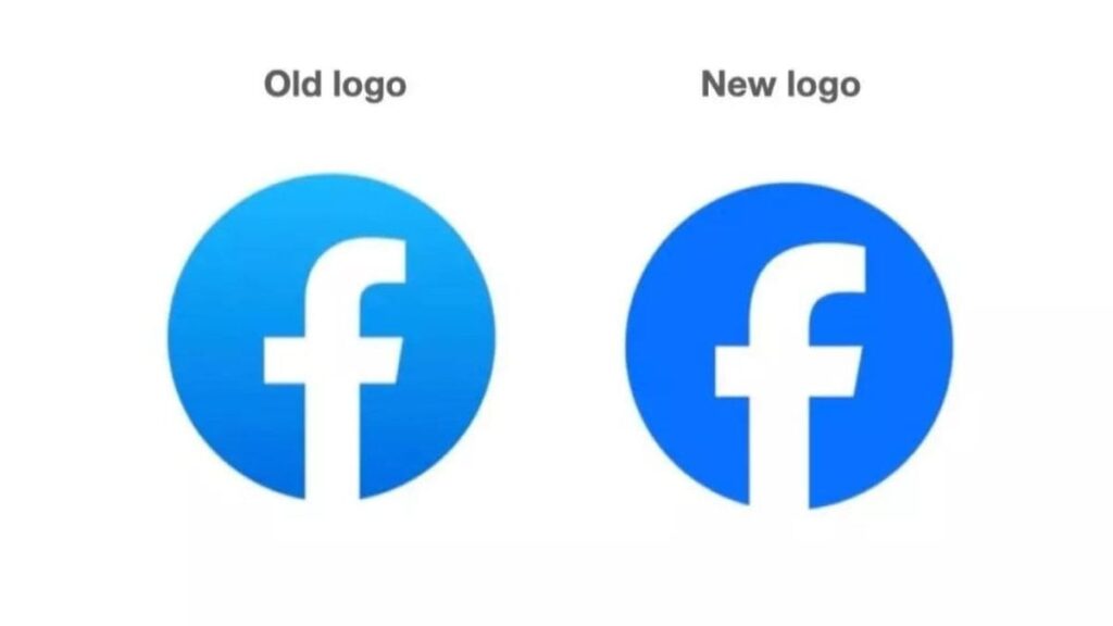
Facebook changes its look: the social media has announced a complete makeover that goes from the logo to the platform interface. In particular, the logo becomes even simpler and the colors “more accessible”.
Facebook changes style: new logo and renewed design
The most obvious change is the new logo, which abandons the three-dimensional and nuanced aspect of the past to embrace a darker and more uniform blue color. The letter “f” also changes, albeit slightly.
Dave N., Director of Design at Facebook, commented on the logo’s evolution, stating (in DDay’s translation): “We wanted to make sure the revamped logo felt familiar, yet dynamic, refined and elegant in its execution. These subtle but significant changes allowed us to achieve optical balance with a sense of forward motion.”

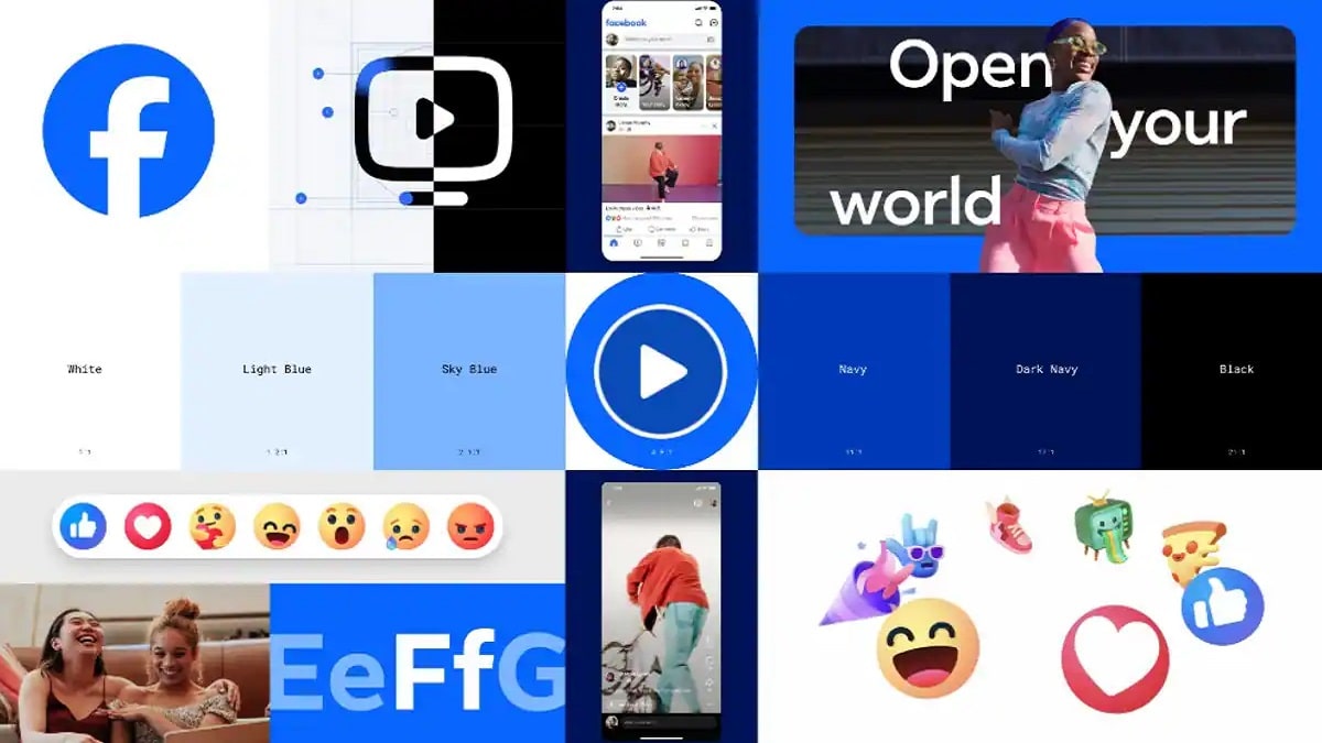
But the restyling doesn’t stop at the logo. Also the character used in the name “Facebook” has been redesigned to make it consistent with the main logo and improve overall readability. Additionally, Facebook has introduced a new color palette that includes different shades of blue. This choice was also made with accessibility in mind, ensuring that the colors are suitable for all users.
There is also a series of “reactions” that allow users to express a wider range of emotions.
All small changes, but which become important even just for the masses of the social network: Facebook matters out of 2 billion active users every day. The goal of this restyling is to further improve the overall user experience, making it more dynamic and satisfying.


Leave a Reply
View Comments