We live in bizarre times.
Times where we are constantly running.
Times in which we give great importance to work and career.
Times in which we are never truly alone, yet a good part of the population feels abandoned to itself.
Times in which we are bombarded with information but struggle to find the right information and assimilate it.
All of this has an impact on each of us, even if sometimes realizing it is difficult, let alone taking time to think about it, to listen to ourselves.
This is where technology comes into play.
Because the same tools that can divide us, distract us, provoke a variety of emotions, distance us from reality, can help us.
It might seem paradoxical to you but in reality Big Tech is lately showing more attention to our mental health than we do.
They do it by telling you how much time you spend in front of your smartphone, they do it by reporting how stressed you are using a smartphone, they do it with apps that include mindfulness and meditation or by giving you noise cancellation to take a break from the chaos of the world.
Now, we certainly don’t want to say that they care and we don’t.
However, even drawing on all our cynicism, we could at least conclude that they have identified a need and are trying to respond to it.
Among the companies on the front line is Apple which, with iOS 17.2, has added a new tool dedicated specifically to our psychological well-being: Diary. Or Journal, if you prefer the Anglo-Saxon version.
Apple’s Diary app: what it is and how it works

Diary is an application.
And no, you don’t have to download it.
If you have updated your iPhone to iOS 17.2 you will find it on your homepage; If you haven’t updated yet, you will need to do so in order to use it.
No big explanations or turns of phrase are needed to tell you what the Apple Diary is.
The name is self-explanatory.
Do you know the classic diary? Not the school one, the secret one. The one that contains our thoughts, the confessions towards our crush of the moment, our frustrations, fears, uncertainties, ugly stickers, newspaper clippings, printer photos, decorations with markers and our most horrible drawings.
Diario aims to be a digital version of all this. But with limits.
iOS 17.2 has been available for a few days but in reality, thanks to the beta, we have been using Apple’s Diary for weeks. Weeks that haven’t seen us be particularly consistent, we’ll tell you straight away, but there’s a reason why. In fact, there are several.
Let’s try to tell you what we liked and what didn’t excite us about the new app created by Cupertino.
What we liked

Diary is one of Apple’s most minimal apps, yet it allows you to do a variety of things.
Let’s try to explain it better.
Once opened you will find yourself in your feed – empty at first.
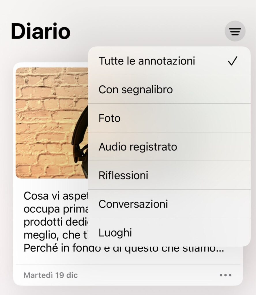
The feed is in chronological order and shows you a preview of the content of the individual annotations inserted.
What can you do here?
- with a tap expand the note, photos or any other included content;
- with a swipe to the right you can add a bookmark to the most important notes;
- Swipe to the left to view the icons for modify a removal the annotation;
- with a tap on the three dots at the bottom right of each note you can view all the things listed above but in a different way.
At the top right we have instead filters, by content type or to view only what you have I bookmark.
At the bottom center you have a huge + to add a new annotation.
And this is where we find one of the things we appreciated most about Diario.
Why Apple’s app doesn’t leave you alone with a blank page unless you want it to.
In fact, the objective is to help you write, to give you ideas so as to help you put down what you feel on paper.
Also because this is the plus of a diary: giving our emotions and reflections to a page in order to be able to free ourselves, to look at them with more rationality, with the right detachment, rather than keeping everything inside and hosting the chaos in our minds.

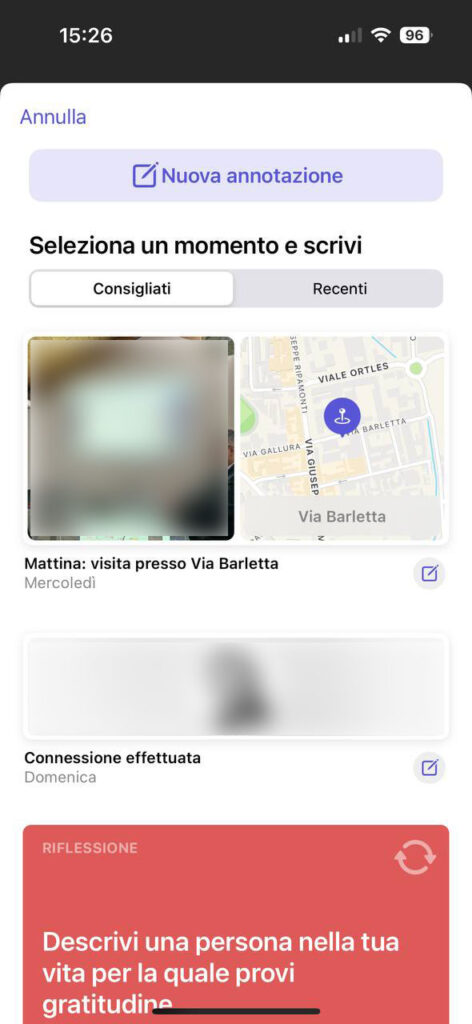
So what does the American giant’s app do? It uses the data collected by your iPhone daily to give you suggestions. For example, places you went today, photos taken today, people you connected with, memories of previous months or even years or a mix of several things that can summarize the events of that specific date.
But not only that: Apple also gives you some food for thought that can help you explore your feelings.
“Describe something you feel grateful for and think about why you appreciate it so much.”
“Take a moment to describe something special in your life that you have taken for granted.”
“What is the kindest comment you could make about yourself?”
In short, they are suggestions that help you look inside yourself, even if many appear simple or harmless on the surface.
But what if I already know what I want to write down? Well, you can ignore Apple’s advice and write what you want. Or upload photos and videos, take a photo, add a voice note or record a location. You can then enrich a note by taking advantage of the digital nature of the Diary app.
What we didn’t like
But up to a certain point.
Dario is not a full text editor.
There are no different colors.
You cannot change fonts.
You cannot add stickers.
Let’s be clear, these are not things that could radically change our experience of use but we wouldn’t have minded using the stickers created with the iPhone also within this Cupertino app.

There is another shortcoming in Apple’s Dario which instead weighs a little more: the absence of a date filter or calendar. To go back in time I have to scroll through all the notes. Today, when we have few of them, it is not a problem, next year it could become problematic.
It also lacks a search bar. If we wanted to search for digital pages that talk about a specific person, I couldn’t do it. If in January I want to filter the notes in which I mentioned Christmas, I will have to give up.
Of course we expect all this to be added in the future but it is still strange that it is absent now, at the launch of the app.
Finally we come to the thing that perhaps troubled us the most: Diary is for iPhone only.
There is no version for iPad, nor one for MacOS.
We spent years writing a diary, first as a child or then as an adult, either as an outlet or as an explicit request from a psychologist or therapist.
When we think of the act of keeping a diary, we think of a piece of paper and a pen. Because, despite digitalisation, a good part of us still see it that way.
Apple Diary forces us to give up this approach.
If we want to add a note we have to use the small iPhone keyboard and our fingers, a rather inconvenient operation when the inserted text is quite long.
Right, we could dictate our thoughts, we could use voice notes, but this limits the freedom of the individual user a bit, and it’s a bit of a contradiction: I’m free to use multiple media but not free enough to write with a pen on an iPad. Or with a large keyboard on a computer.
So does it make sense to try Apple Journal?

The title of this article states that Apple Diary has convinced us.
Yet, you will have noticed, there are key elements that did not excite us, shortcomings that we struggle to explain.
So why isn’t this a rant? A failure?
There are four reasons that lead us to appreciate what Cupertino has done.
The first is the underlying philosophy.
The app has limitations but was born with the aim of helping people, of providing a tool for people’s psychological well-being, which we too often ignore and which we have only recently begun to consider important. With difficulties and resistance. Even our own towards our own mental balance.
The second is the intuitiveness.
Diary is minimal but very simple to understand and master. There aren’t too many options, settings and things to get lost with. Even setting a reminder or adding Face ID to avoid prying eyes is immediate.
The third is accessibility.
We are talking about an app that it is on the smartphone, a device that is with us constantly. An app that you don’t even have to install because it comes with a system update.
We therefore imagine that people will open it out of curiosity and discover that they can keep a private diary with extreme ease, perhaps initially only by adding photos, places, people and then being drawn into deeper reflections.
There are those who may never have wanted to have a diary but suddenly find themselves fascinated by this tool.
There are those who might be ashamed but the shame disappears if it’s just an iPhone app that asks for a few things and little effort.
There are those who would like to keep a diary but don’t know where to start.
In short, his being there, at hand, could make a difference and help many more people than you think.
The last reason is the security.
The information that is used is and remains on your iPhone. Even the Journal app doesn’t have access to annotation suggestions until you tell it that yes, you want to create one with that data.
And then there’s end-to-end encryption to iCloud and the aforementioned Face ID (or Touch ID).
This means your thoughts are safe, always.
The future of this app, and many others
We are certain that this is just the beginning.
Most likely the Diary of…


Leave a Reply
View Comments