Samsung recounted the process that led to the design of the new line of smartphone Galaxy S22. A work of reflection, research, time and values. By taking us behind the scenes of the production of this top-of-the-range line, the Korean giant wants us to appreciate these elegant devices even more.
Samsung takes us behind the scenes to appreciate the design of the Galaxy S22
On its blog, Samsung explained that the origin of the design of each product in the history of the line Galaxy S, which has always represented the best of his work in the smartphone world, there is simplicity. Straight lines, flat shapes, which can harmonize the combination of technology and design.
In fact, Samsung explains that the new Galaxy S22 line only wants to highlight the fundamental elements of a smartphone, giving them the right emphasis. In practice, this meant providing all smartphones in the line (S22, S22 + and S22 Ultra) with a fronte and retro both flatthe. The buttons and ports on the four sides of the devices were reduced to a minimumto give a feeling of silk from all angles.
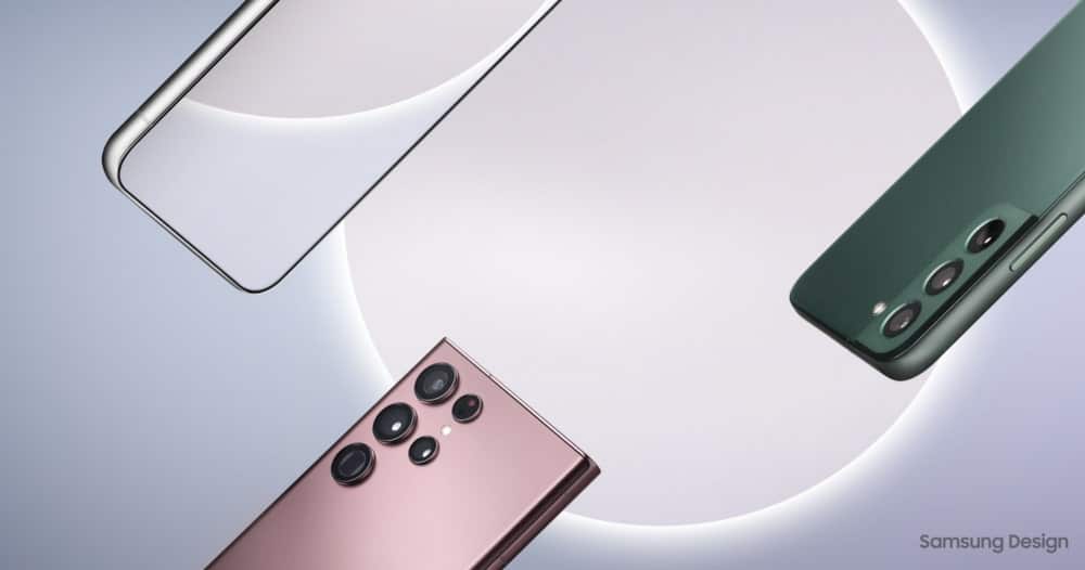
But Samsung also wanted to find harmony in the camera department, designing a style that the Galaxy S line will also have in the future. In particular, the cameras of Galaxy S22 and S22 + have been positioned to be equidistanti from the vertical and horizontal edges of the device, to enhance its elegance. The coating around the cameras is the same color as the rest of the body, while being metal, to create continuity while highlighting the cameras.
The design also allows you to reduce the thickness of the cameras, without giving up the space needed for the optics to capture the light needed for unique shots. In the Ultra, the metallic coating of the cameras reflects the color of the device to harmonize with the rest of the phone.
The relationship with the S Pen and the graphical interface
Samsung Galaxy S22 Ultra integrates in the best possible way the S Pen, taking advantage of what for many users becomes the preferred way of interacting with the smartphone. Samsung engineers have been busy making it possible reduce latency by 70% of pen touch, providing the closest experience to writing on paper on a screen possible.
The teams that developed the hardware design and those that have optimized the interface, working together, they were able to introduce some features only possible on such a large screen and using the S Pen. For example, you can open the Samsung Notes in un pop-up or split screen, to take notes from a web page.
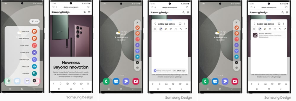
But the graphical interface of One UI allows you to make the most of screen space across the board. For example the Smart Widget they can become useful based on your location or time of day. And they can also better manage the smart home.
Also there are new features related to artificial intelligence for the camera, strength of the whole series but above all of Galaxy S22 Ultra. The new Samsung Wallet allows you to combine digital payments, register documents and simplify the management of the most sensitive data.
The design of the Galaxy S22 line: more and more customization
Samsung knows that there are several users who want to buy its top of the range. There are tech enthusiasts, those who simply want the best possible Android experience, photography lovers. For this reason, with the colors of the line, he wanted to give the possibility that they were premium and classybut also to the fashion.
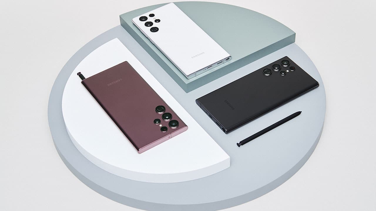
In fact you can find all the devices in the classics Phantom Black, Phantom Whitebut also in Green. Instead Pink Gold is exclusive to Galaxy S22 and S22 +, while the Ultra has the Burgundy. Black embodies elegance, white reflects the simplicity and positivity expressed by the Galaxy S line. Green reflects modern tastes, burgundy enhances the premium value of the smartphone. The rich color of rose gold has a texture that reveals even more colors.
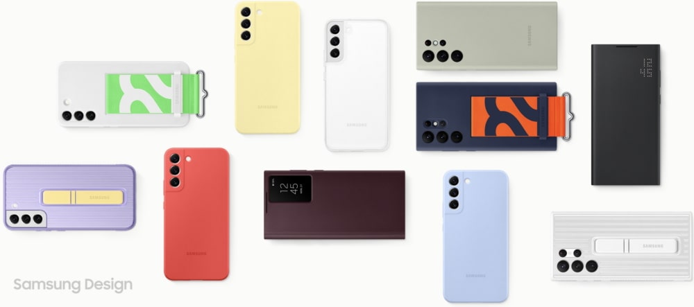
But the customization can also be seen in the accessories, which are many and very varied. There S-View Flip Cover it has the same taste seen on the Galaxy Watch, allowing you to combine the two devices at best. There Frame Cover offers different back plates according to your needs and tastes. There Silicon Cover with it Strap match the bold graphics and make your mark. There Protective Standing Cover offers different color combinations, as well as comfort.
Finally, Samsung also took care of the packagingwith the number 22 in the background ‘S’ on the box. But above all, packaging uses 100% recycled paper. And this also includes the accessories and manuals you find inside. It also reduces the size by 56% compared to the Galaxy S20 packaging.
Samsung has always led the smartphone world in terms of style, especially with its Galaxy S line. Which has changed a lot over the years, but has always looked for a compromise virtuous between being in fashion and living in classic elegance. Do you think the new Galaxy S22 line did it? Let us know in the comments.







Leave a Reply
View Comments