After WWDC 2022, Apple executives Craig Federighi e Alan Dye commented on one of the biggest updates to iOS 16, the redesign of the lock screen. In an interview with TechRadar, the two commented on the choice of the novelty introduced by the Cupertino company. The screen definition process seems to have started with iOS 14, when Apple first added customizable widgets. And then it hit its peak with the recently unveiled update. Let’s go then to find out what were the comments of the two executives.
Craig Federighi comments on the redesign of the iOS 16 lock screen
“We saw a real opportunity to take that area that has really slowly evolved over time but has never seen this kind of huge breakthrough, and to do something really big, but something very Apple and very personal. So, this is an act of love this year “, so Craig Federighi commented on the redesign of the lock screen of iOS 16. Alan Dye, on the other hand, said that Apple’s goal” was to make the iPhone even more personal ”as the lock screen is the“ iPhone icon “.
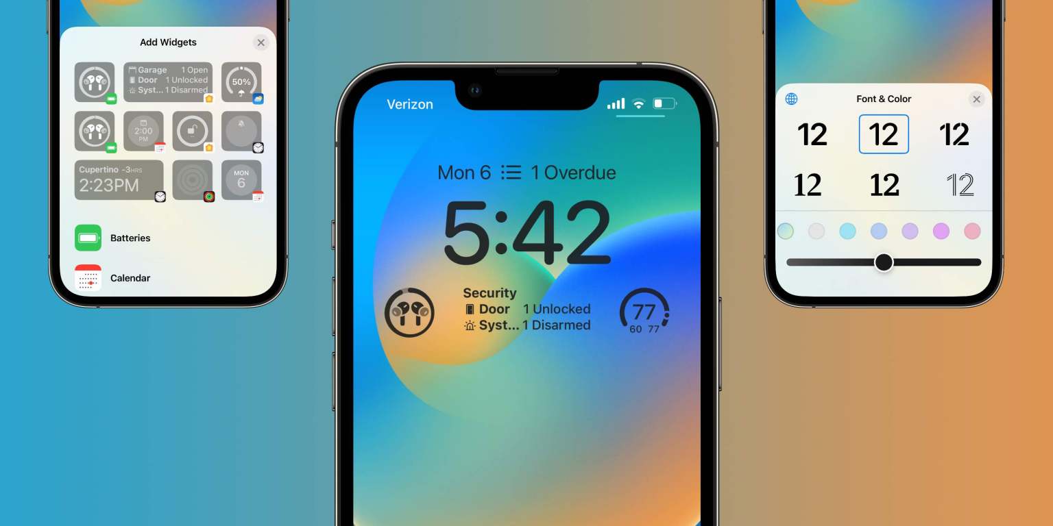
TechRadar reported that Apple has been considering changing the lock screen completely. In this regard, Dye commented on the path taken by his design team, who worked at San Francisco font customization from Apple. “Typography is a great passion for us design teams and we have a number of other Apple design typefaces, even some non-Latin scripts. So, for the first time, we allow users to choose their favorite “.
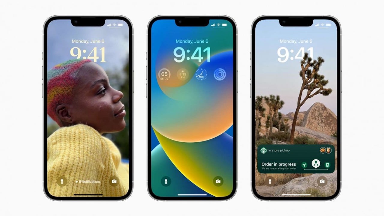
Among the other novelties of iOS 16 there is the possibility of making a portrait photo appear in front of the clock, bringing a depth effect. A solution borrowed from the Apple Watch, developed using machine learning. “There are actually about a dozen neural networks that study the photo based on the fact that it is an important subject, if there are people, how they are framed and cropped in the photo, their expressions – says Craig Federighi -. All of these things that allow us to automatically bring out truly amazing and compelling options for people and then render them on screen in a way that makes them feel completely new. “
Craig Federighi also explained the intentionality behind the placement of widgets, balancing customization with iPhone interface consistency. “It would have been very easy for us to say ‘Hey, drag anything everywhere.’ Honestly, technically, this wouldn’t have been a challenge ”. In short, Apple executives have spent many words on the new lock screen. After all, this is one of the most incredible innovations ever. And soon we’ll find out too.






Leave a Reply
View Comments