The first hours in the company of Fitbit Sense 2 we were thrilled. The smartwatch of the US company, now owned by Google, is extremely comfortable, able to adapt perfectly to the wrist and to “disappear”, while taking care of collecting a lot of data for you. After a few days, however, we began to notice the small shortcomings and limitations of a product that comes on the market with an important cost: 299,99 €. We tell you everything in this review.
The Fibit Sense 2 review
We talked about “smartwatch” but in reality it is not the most suitable term. Although the aesthetics and part of the functionality could assimilate it to a smart watch, Fitbit Sense 2 is more of an advanced fitness tracker, lacking the ability to install third-party applications. And this is actually just one of the reasons why, in our opinion, the American company is still halfway there: the latest arrival is a hybrid that has not yet decided which path to take, oscillating between the desire (and the need) to evolve to become a real smartphone and to remain anchored to the Fitbit tradition, which for years has been giving us complete products in terms of fitness and well-being.
Design
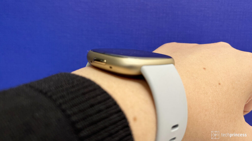
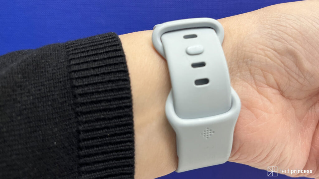
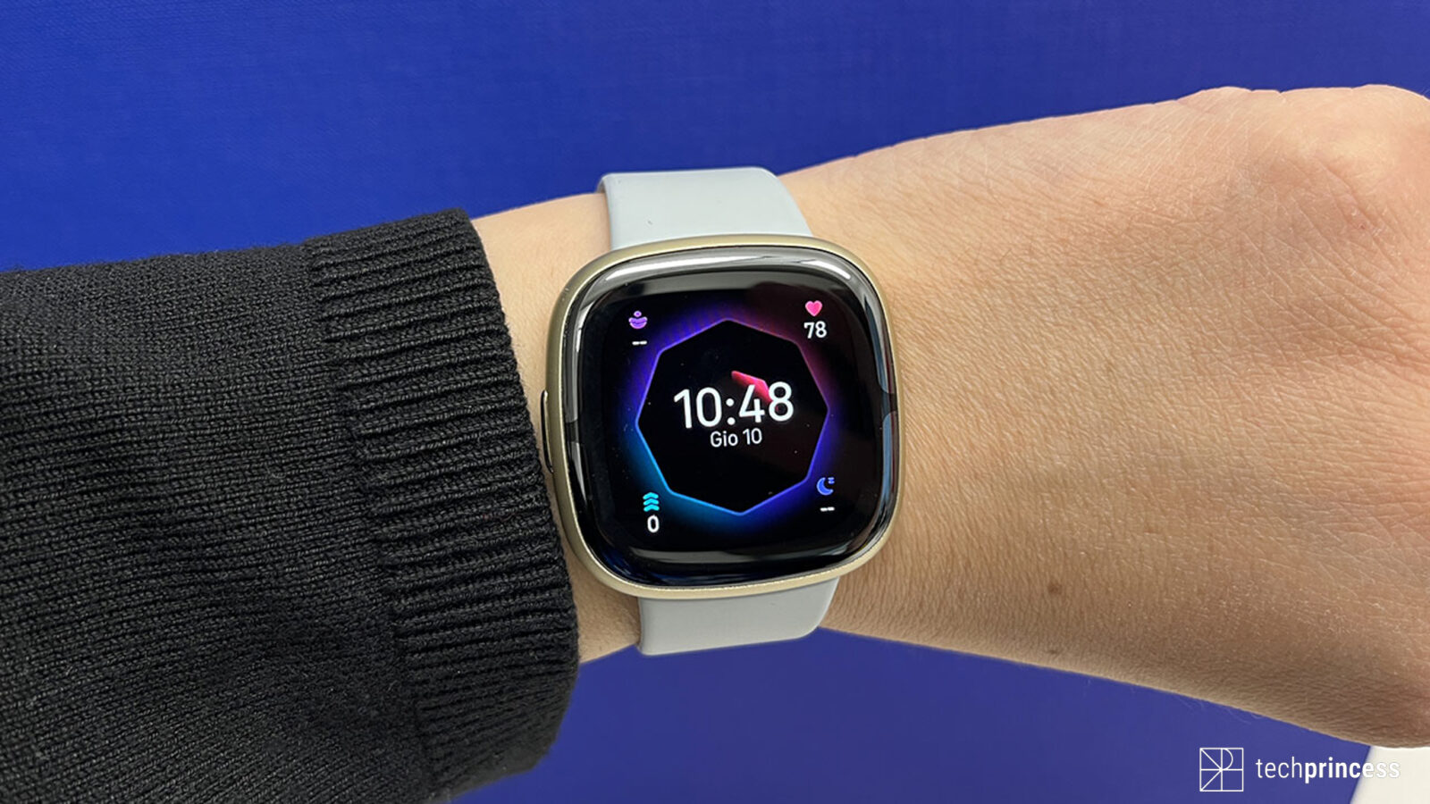
The design of Fitbit Sense 2 is similar to that of its predecessor: we have a square dial with rounded edges, an aluminum body – available in graphite, platinum gray and gold -, a comfortable elastomer strap (in the small and large variants) and a strap attachment system that is particularly intuitive.
The dimensions as well as the sensors on board are also unchanged.
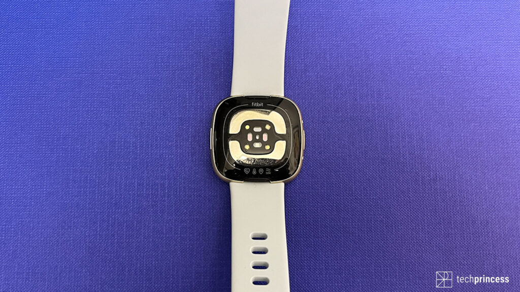
So are they identical? Not exactly. There are two differences to note: the first is the presence of a physical keywhich replaces the touch button becoming more comfortable in everyday use, while the second concerns the placement of the electrodes for the measurement of the electrocardiogram, which are now inserted into the glass that protects the display instead of the case.
Small changes, it’s true, but we find absolutely spot on: Fitbit has changed what didn’t work perfectly while keeping the elements that users had appreciated in the first version unchanged. In short, as always, a winning team does not change, at most small adjustments are made.
All of this makes Sense 2 truly very practical in everyday use: you barely notice its presence, even during physical activity or sleep, not to mention that the aesthetics allow you to use it even in more formal situations, without looking out of place. Plus you can count on water resistance up to 50 meterswhich allows you, among other things, to keep it in the pool and use it for your swimming workouts.
And the display? Don’t worry, we haven’t forgotten. It is simply practically the same as that of the previous model then an AMOLED touch, with a resolution of 336 × 336 pixels and a brightness that guarantees good visibility even in the sun. Finally, we would like to point out the support foralways-on display which, in our opinion, is perhaps the best solution for those who need to always keep the timetable under control. What do you mean? Fitbit Sense 2 has 3 display activation modes:
- button only;
- button and movement;
- always-on display (AOD).
Normally we would have opted for the second mode which, on paper, allows you to see on the fly what time it is even when you have your hands full, without however increasing consumption as happens with the AOD. Too bad that very often the movement of the wrist is not recognized, forcing us to press the key or touch the screen. A defect that we hope can be resolved with a software update.
Fitbit Sense 2 review: how much data!
The real strength of Fitbit Sense 2 is the data it can collect for you: heart rate, skin temperature, blood oxygenation, respiratory rate, heart rate variability, electrodcardiogram, sleep analysis, and stress analysis. There really is everything but, even here, some limits emerge. The first concerns blood oxygenation (Sp02). While many smartwatches provide a special menu and the possibility of measuring in real time, Sense 2 detects the data during sleep but does not show it to you. Or rather, make a graphic that you find on the application and that you can, however, consult only the following day. Alternatively you can use a watch face dedicated to the Sp02, available in the appropriate store.
In short, the system is a bit cumbersome and undoubtedly can be improved.
The other aspect to consider is that yes, the information is a lot but not always well explained.
We give you two opposite examples.
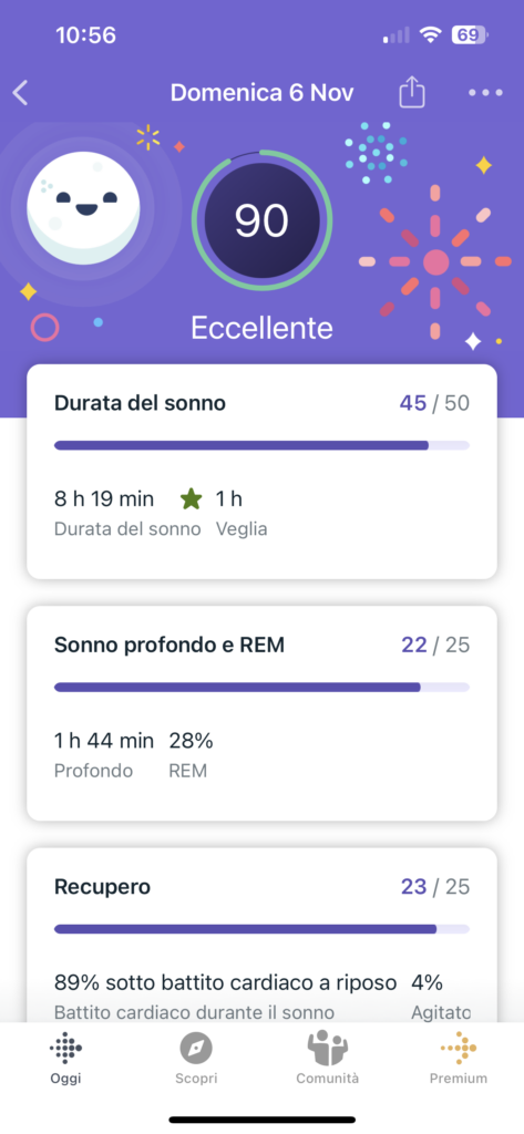
The sleep analysis is extremely complete, where all the data are clear, interpretable, well divided and well explained.
The skin temperature, on the other hand, is an unexplained graph. Or rather, you have a description of what it is but not the tools to understand what the variations mean.
To this we add another element: some data are only available by activating the Premium subscriptionincluding advanced sleep analysis which is one of the biggest pluses of Sense 2. The cost? € 8.99 per month which add up to the practically 300 euros of the product.
Fitbit Sense 2 review: interface and application
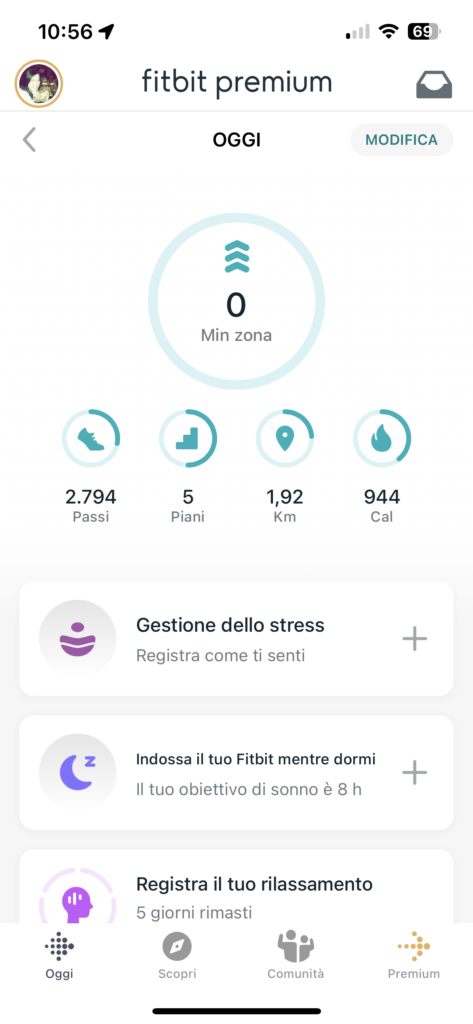
You can access Fitbit Sense 2 information and features in two ways: directly from your watch or through the app.
The product interface is quite intuitive: just swipe left or right to get widgets that show physical activity data, weather, heart rate, sleep and more, while pressing the button opens all the available features.
You also have the double click on the physical button that acts as a shortcut for Alexa, the settings, the body responses and Fitbit Wallet while the long press calls up the voice assistant, which yes, it is only that of Amazon. Google Assistant is inexplicably absent, especially considering that Fitbit is owned by Google.
Everything is therefore very simple even for newcomers, but it is a pity for some uncertainty and too many lag that we find little justifiable on a product of this level.
The application, on the other hand, is perfect: fast, complete, understandable. There is everything you need, including the flood of data we referred to above.
What is missing?
Legitimate question. We have already anticipated the inability to install third party applications but what does it mean? Well, while other smartwatches allow you to add features, the Sense 2 doesn’t. For example, no Spotify directly on the wrist. Or, again, no smart home management app.
In the future, Google Maps and Google Wallet should arrive but this update does not have a precise date yet.
Fitbit Sense 2 also includes a few other waivers.
For example, Wi-Fi is missing, which allowed you to download your favorite songs directly into the fitness tracker. And, for consistency, there is no longer the possibility to connect earphones watch to listen to music without your smartphone.
We have GPS but not the most accurate and responsive on the market. The time it takes to lock on the signal is surprisingly long and the recorded path deviates several meters from reality.
The Fitbit Sense 2 review: conclusion
Fitbit Sense 2’s biggest enemy is Fitbit.
We explain ourselves better.
The newcomer has some shortcomings but, on balance, we cannot say that we have not found ourselves well. However, it is very convenient, with a nice display visible under the sun, a complete app and an immensity of reliable data to refer to, data that you can also collect a printable and shareable pdf, for example, with your doctor. . And then he takes care of you, asking yourself how you feel, inviting you to breathe and take two minutes for yourself to meditate on how you feel. As useless as it may sound, it will help you keep calm and always be aware of how you are.
They are not beginnings, they are elements that favor your psychophysical well-being and help you monitor it. Consistently and without worrying about the battery that guarantees 4-5 days of use.
The problem is that it is sold as a smartwatch even though it technically isn’t. And it is sold at the price of a smartwatch (+ subscription) even if there are no third-party apps, it does not allow you to respond to notifications, it does not allow you to use a microphone and speaker to manage calls, it does not provide music directly on the device … In short , something is missing. Something that could make you lean towards the previous model or even the Charge 5 which collects more or less the same information.
Perhaps at a lower price it would have been more attractive.
PRO
- Very comfortable and elegant
- Clearly visible display
- Physical button
- A lot of data
- Very complete app
VERSUS
- A few too many uncertainties
- Unresponsive and accurate GPS
- No third party apps
- Important price + monthly subscription







Leave a Reply
View Comments