

Do you remember that ithe old Facebook? The blue bar that dominated the top, the tide of pending requests in the right column – those of games we had no intention of playing -, the section dedicated to contacts and updates, the right column with everything you needed close at hand …
Two years ago, everything changed. Everything has become less blue but above all more minimal. Perhaps not always super intuitive but at least in step with the times.
Now Facebook looks ready for a new redesign. In short, we change. Again.
A new design for Facebook?
To tell it is Stan Schroeder on Mashable, who found himself a tester of the new Facebook look.
Yes, “testers” because most users cannot see the new aspect of Mark Zuckerberg’s social network. And Meta does not mention it in any official communication.
We are therefore faced with a possibility rather than a certainty: Facebook COULD become like this for everyone but it is not necessarily the case. So immediately calm the hot spirits and breathe a sigh of relief. And “relief” is the right word since the new proposal by Zuckerberg and his companions does not seem particularly attractive
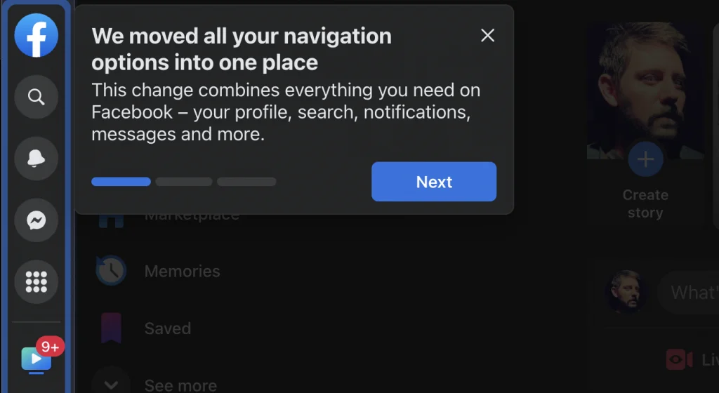 Photo Credit: Mashable
If we were to summarize the “new” Facebook we could say that it has been moved all the way to the left. All.
All menus, settings, icons… everything is to the side.
“We’ve moved all navigation options into one place. This change combines everything you need on Facebook – your profile, search, notifications, messages and much more ”, says the wizard that accompanies the user to discover the new interface.
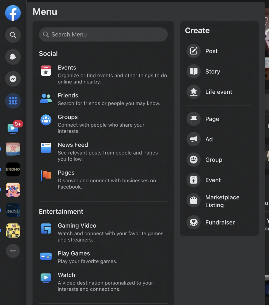 Photo Credit: Mashable
The problem is… too much. Too full, too confused, too unbalanced. Too much of everything.
On the right, in the lower corner, we have the button to start a new conversation. For the rest the right part of the page is composed of emptiness and desolation. In stark contrast to the chaos we have on the left.
Not to mention, Schroeder points out, that the message window doesn’t seem completely finished. He should in fact suggest people to send the message to but he doesn’t.
For all these reasons the general feeling is that Facebook is just a test, something reserved for a small number of users to then obtain useful feedback to improve the user experience. And the user at this moment seems to be telling Meta that the idea is terrible.
True, there have been other companies that have chosen to move everything to the left, such as Gmail for example, but the approach may not necessarily work for all websites.
We must then necessarily point out that each of us has different tastes. What today seems to make no sense to us could instead be very comfortable for someone else.
Only time will give us what the solution will be approved by as many testers as possible.
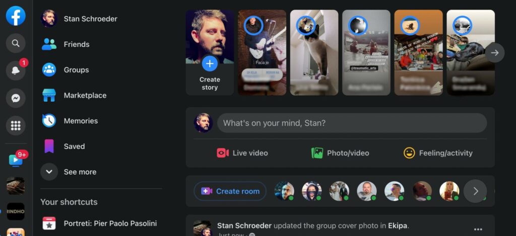 Photo Credit: Mashable
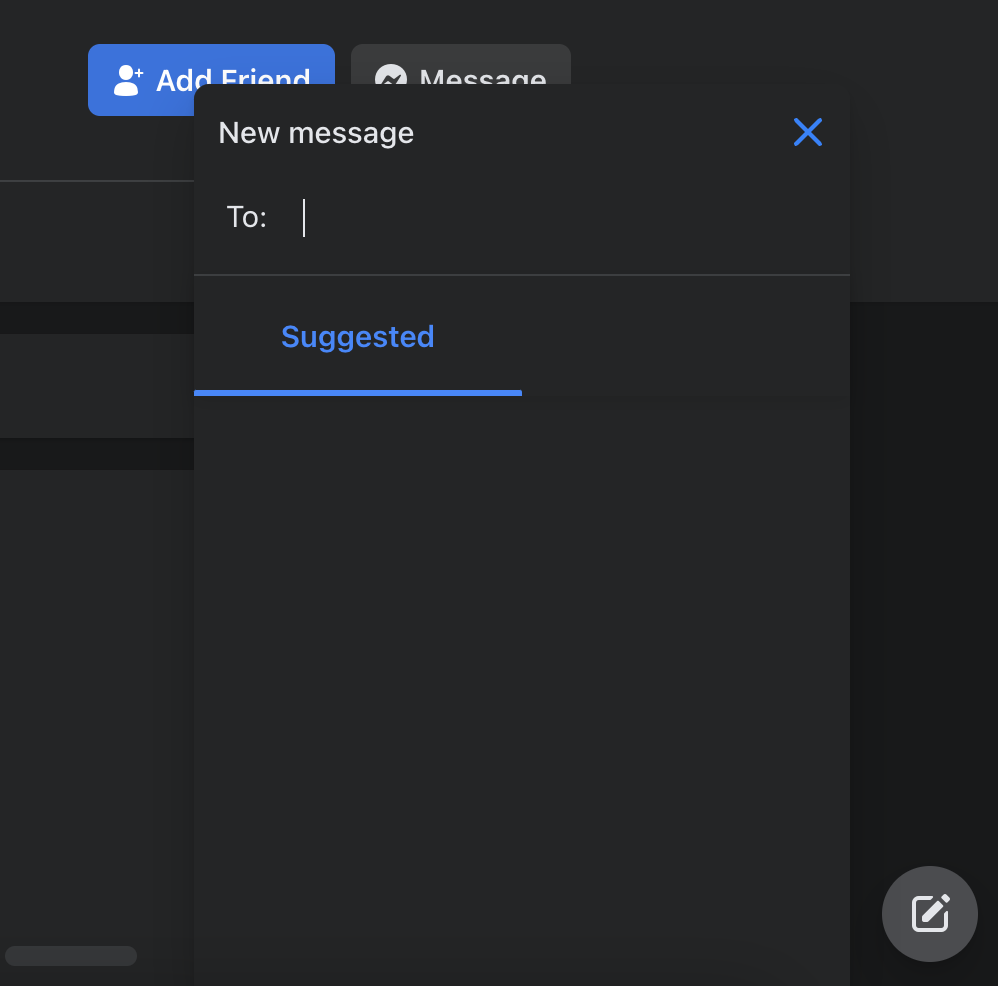 Photo Credit: Mashable