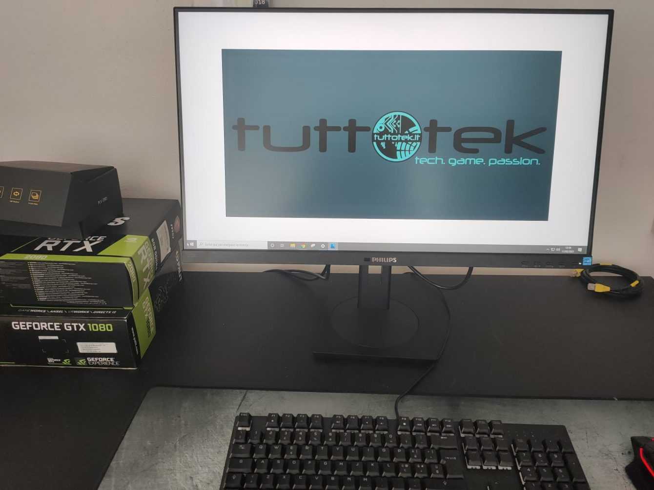
In this article we are going to discover the review of the Philips 272B1G monitor. A panel that focuses on the environment and technology at the service of the planet
In this historical moment, technology runs, runs like never before. New video cards, the search for perfect detail, the unconditional need to aim for the top. Unfortunately, however, we often forget that our planet’s resources are not infinite and we often find ourselves buying more than what we really need.
I don’t want to make speeches like a false moralist, I who, for passion and professional deformation, have made technology a lifestyle. It is also true, however, that having the possibility to choose is always a very good thing. With its 272B1G, Philips offers us this choice and, perhaps, the great strength of this monitor lies precisely in this… but not only!
Philips 272B1G review: technical specifications
We are faced with an IPS panel with a maximum resolution of 1920 x 1080 pixels. The response time from gray to gray is four milliseconds. The horizontal and vertical viewing angles stand at 178 °.
- Screen Size: 27 inches
- Panel Type: IPS
- Native Resolution: 1920 x 1080
- Typical maximum brightness: 250 cd / m²
- Response time (G2G): 4 ms
- Refresh Rate: 75 Hz
- Contrast ratio: 1.000: 1
- Viewing angle: 178º horizontal, 178º vertical
- Backlight: WLED
- Built-in speakers: 2 W x 2
- Energy consumption: ECO mode 10.5 W (typ.), Standard mode 14.7 W (typ.)
- Weight with pedestal: 5,74 Kg
- Other: Antiglare, 3H, 25% opacity, SmartImage
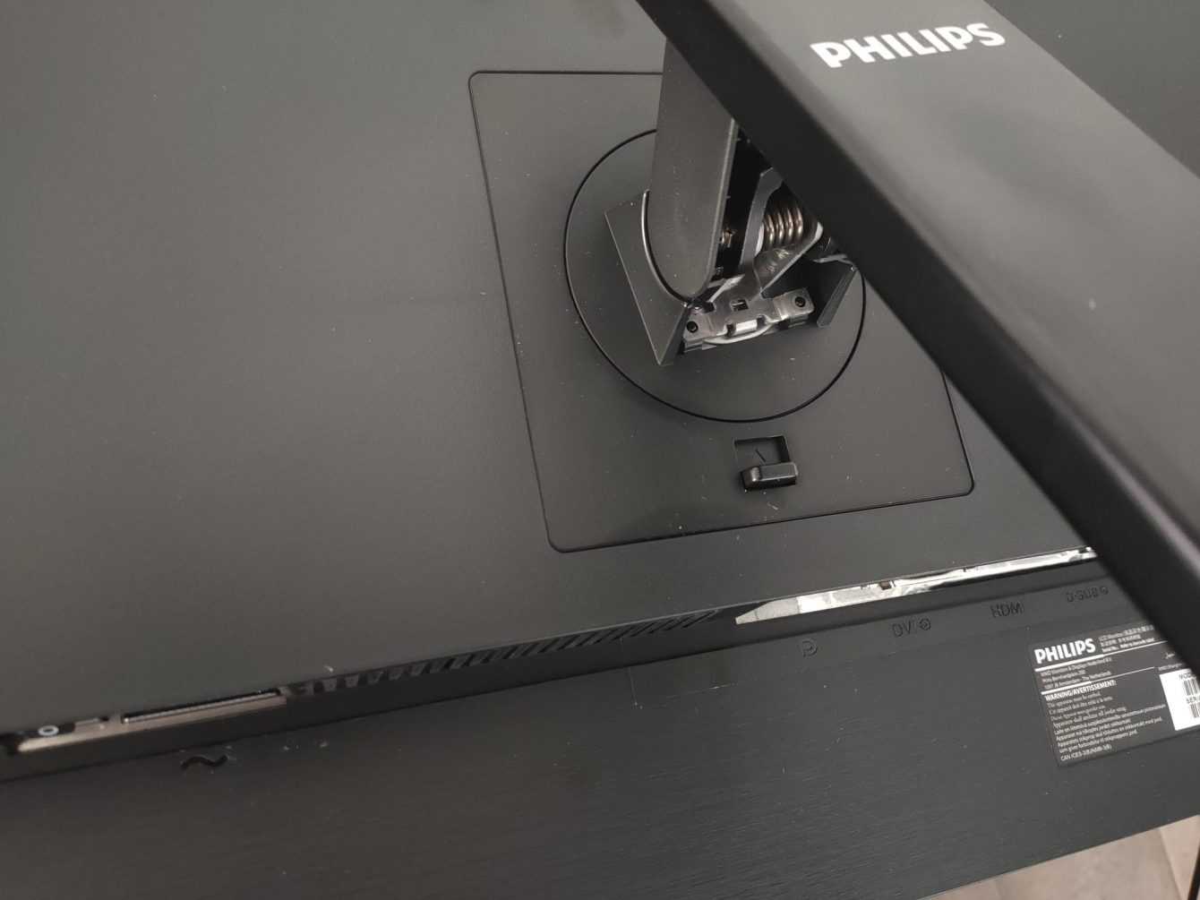
Philips 272B1G review: aesthetics and construction
The materials chosen for this monitor could only be eco-green. In fact, in many of the models of this line it is possible to use up 85% recycled plastics and the packaging is all made from recycled paper, in short, we can only applaud the super green choice of Philips.
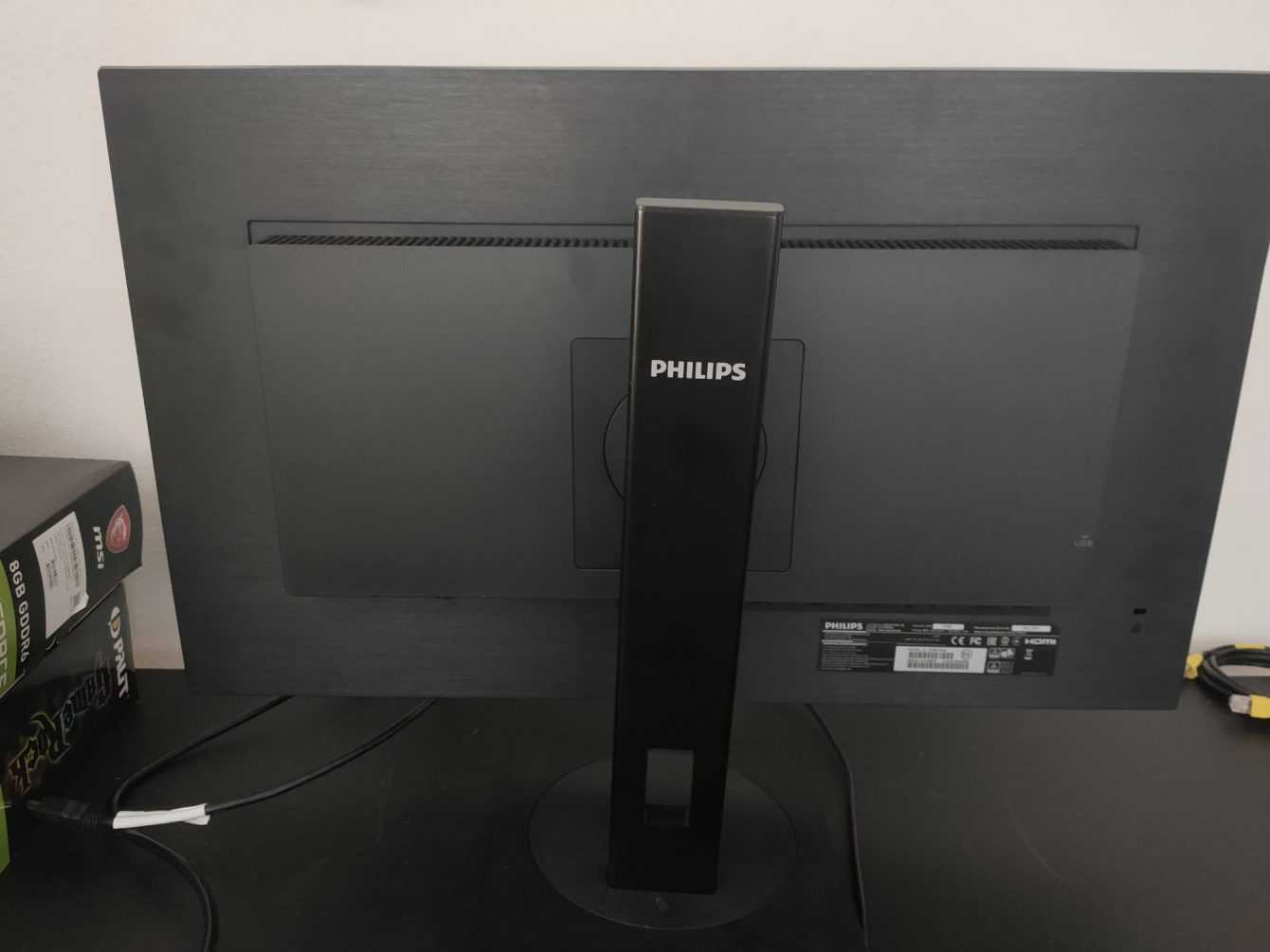
Despite the green choice, the materials chosen are robust and solid. There are no creaks whatsoever and overall the monitor returns a strong and lasting feeling. The frame of the panel is very thin on three sides and obviously more accentuated on the part that points to the base. Obligatory choice to contain the function keys of the monitor.
The Philips 272B1G, whose review you are reading, boasts a sober and elegant black all over its surface. The pedestal is not very bulky (actually exactly the opposite) but, despite this, it boasts the ability to rotate 180 ° and be adjusted in height thanks to a comfortable slide.
OSD and accessories
The OSD is managed in a very intelligent and functional way. In fact, thanks to the 4 keys plus the on / off key, we could navigate the menu to easily reach each adjustment parameter.
When it comes to connections, the Philips 272B1G boasts multiple possibilities. In fact, we could choose to connect the monitor to our PC through an analog VGA input, a DVI-D input (digital, HDCP), a DisplayPort or even an HDMI 1.4 input. Do not miss the USB ports (USB-B x 1 (upstream), USB 3.2 x 4 (downstream with 1 fast charge BC 1.2)) and the audio input and output ports.
Also of note are several very popular features. One above all the LowBlue Mode which allows you not to tire your eyes despite intense and prolonged use. However, we cannot afford not to mention the LightSensor which allows us to adjust the brightness of the image according to the light in the room for a perfect image with minimum energy consumption.
As for the accessories, we can safely say that as usual Philips does not miss anything. In a world where it is difficult to find a charger inside a smartphone box, we are pleased to find an almost complete set of cables. In fact, inside the package we find one DisplayPort cable, one HDMI and one DVI-D type, but the USB cable is missing. Besides obviating the manuals and the monitor with pedestal and transformer.
Philips 272B1G review: test and calibration
Let’s see how the Philips 272B1G fared in our tests and calibration.
Subpixel and surface layout of the Philips 272B1G
The subpixel layout of the monitor is the standard RGB strip (red, green and blue). This is the most common layout and the one that modern operating systems, including Microsoft Windows e MacOS by Apple, they use to work correctly by default. As a Windows user, you do not need to run the wizard ClearType, although it is still possible to do this based on preference. And as a Mac user, you don’t have to worry about text fringing issues caused by less common subpixel layouts.
On this monitor it is used an opaque and lightweight anti-glare screen surface, with a smooth surface to keep the image grain-free. The low haze element of this chosen solution favors the monitor’s color vibration potential, while still maintaining good glare characteristics to avoid the kind of reflections that would be seen on a glossy screen. Regardless of the screen surface, it is important to organize your lighting environment and avoid light hitting the screen directly.
Testing the Philips 272B1G presets
Readings were made using a colorimeter Xrite i1 Display Pro. Our test system used a GPU Nvidia GeForce GTX 1080, connected via DisplayPort. Windows 10 is used on this system with the monitor connected to the PC with no additional drivers or ICC profiles loaded. The monitor was left to run for over 2 hours before the readings were taken.
The following are the default preset settings with which the out of the box tests were performed:
- Brightness = 100
- Contrast = 50
- Gamma = 2,2
- Temp. colore = Default 6500K
- Rosso = 100
- Verde = 100
- Blu = 100
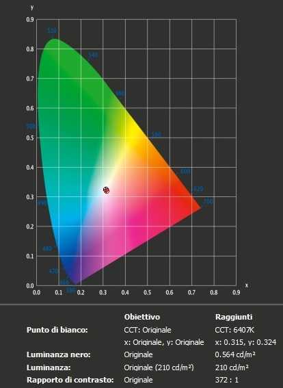
With the settings out of the box, the panel appears very bright but rich in color with a strong variety of shades and textures. The image has a very slight green bias (see white point) and some shades have extra depth due to incorrect gamma management, but nothing too much for general use (nothing serious and easy enough to correct with adjustments of the color channels as we will see later). Bad contrast ratio, much lower than the declared 1000: 1.
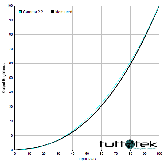
Not perfect, as mentioned, the management of the range, which did not trace perfectly as “2.2”. The default gamma mode did indeed provide decent gamma performance with a slight decline to “2.3” for some intermediate shades. The image below shows the gamma tracking under the default settings.
Philips 272B1G calibration
Our calibration settings resulted in significant reductions in brightness and some color channel adjustments, in order to better balance the values and reach the target of 6500 K. in terms of color temperature (without noticeable distortion). As noted earlier, the monitor’s gamma tracking is not ideal (albeit accurate enough for its intended purposes) but the situation improves dramatically after calibration.
We emphasize that the variation between the units and other environmental problems could affect the results of our ICC profile (download profilo ICC per Philips 272B1G) on a different device. To achieve ideal values from a chromatic point of view, such as absolute accuracy of the range, the ideal is calibrate your individual unit with a colorimeter or a similar device.
Anything not mentioned in our post calibration setup has been left on default values.
- Brightness = 40
- Contrast = 50
- Gamma = 2,6
- Temp. colore = Default 6500K
- Rosso = 100
- Verde = 100
- Blu = 100
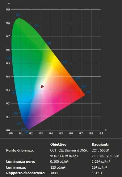
After calibration the white point is more precise but not perfect (canceling the green trend) and the range gives an almost perfect response.
The initial mean contrast ratio was 372: 1, after calibration the ratio of static contrast remains below expectations at 531: 1.
Uniformity of lighting
We observed a black background on the panel in a dark room and could see a slight phenomenon of backlight bleed, particularly as a sort of “spotlighting” towards the top and bottom right corners. As usual for IPS-type panels, there is also a silvery or slightly yellow “glow” that varies depending on the viewing angle. This can be seen from a normal viewing position particularly towards the lower corners of the screen. Unlike backlight bleed, it’s not something that varies between individual units. The photo below was taken from a few feet and perfectly central so that this ‘glow’ was not captured, instead offering an accurate reflection of how evenness of the backlight, excluding this glow, appeared for the dark content.

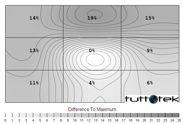
Screen luminance uniformity is variable, but overall reasonable. The brightest point recorded is the “quadrant 5” in the center of the screen (155.0 cd / m²). The biggest deviation from this occurred at “quadrant 2” above the center (126.2 cd / m², which is 19% darker than the center). Elsewhere the deviation between a given quadrant and the brightest point was 4-15%. It is important to remember that uniformity varies according to individual units and you can expect different deviation beyond the measured points. The profile map below graphically represents this information, with darker grays representing lower luminance and therefore greater deviation from the center point than the lighter grays.
Color deviation
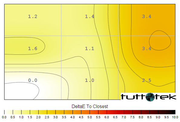
Deviations in color temperature (white point) were also analyzed, with measurements made using the same 9 quadrants. Deviations are assigned to DeltaE values, with higher values and darker shades on the map representing a higher deviation from the 6500K (D65) daytime lens than lower values and lighter shades. Here, a DeltaE> 3 is considered a significant deviation that most users could notice quite easily by eye.
Philips 272B1G review: the verdict
With minimal adjustment of the values in the OSD, including the mandatory huge dimming of brightness and some changes to the color channel, the image drawn by Philips 272B1G is vivid and varied but accompanied by a contrast ratio not up to par.
The anti-reflective surface of the panel has a fairly smooth facade, avoiding the kind of intrusive graininess which can be seen on some matte surfaces of other products.
The ideal environment for this monitor is the office. Connectivity with the addition of USB ports, integrated speakers, good …


