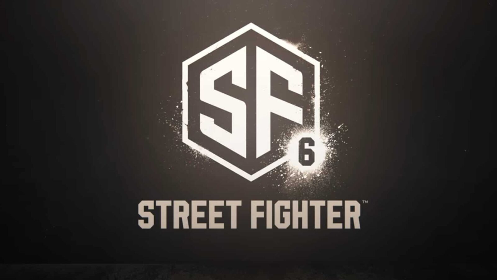
No more bright colors and cursive lettering: the new Street Fighter 6 logo leaves many fans dumbfounded. To the point that it appears to be from one of Adobe Stock’s paid assets soon.
Street Fighter 6 and the logo that is causing discussion on the network
There is great anticipation for Street Fighter 6, the latest installment of the popular home fighting franchise Capcom. The announcement took place in the past few hours, but there is something that just does not convince the fans. The development house has in fact also revealed the new logo, which seems to have abandoned the colorful and lively style of the previous chapters. No writing in italics and no orange: black background on white initials and goodbye Roman numerals.
On a graphic and meaning level, the Street Fighter 6 logo is a very clear (not to say traumatic) break with the past. Starting with 6, which is not VI. pic.twitter.com/qNXJtpTKkC
— Marco Mottura (@_Mdk7_) February 21, 2022
In reality, to discuss even more the stylistic detachment is a fact that emerged from some users: the logo would be taken from an asset that can be purchased on Adobe Stock for 80 $. For those who do not know Adobe Stock is a site that allows you to purchase, upon subscription, images, photos, vectors and in general assets to create visual content. In particular a Aurich’s tweet (graphic designer, creative director for Ars Technica and avid Street Fighter fan) ironically shows us how with the same asset, by changing a few letters, we can all create our own fighting game.
Ready to make your own fighting game called Street Guardians, Street Puncherz, Street Crash, Street Heist, Street Smashers, or Street Assault?
Good news, I’ve got your logo ready! Only $80, it’s a steal pic.twitter.com/XC7qeFqu2U
— Aurich (@aurich) February 21, 2022
At the moment, Capcom has not received responses regarding the allegation of having purchased the logo on Adobe Stock. Let’s hope you don’t send Chun-Li to take revenge on the detractors.


Leave a Reply
View Comments