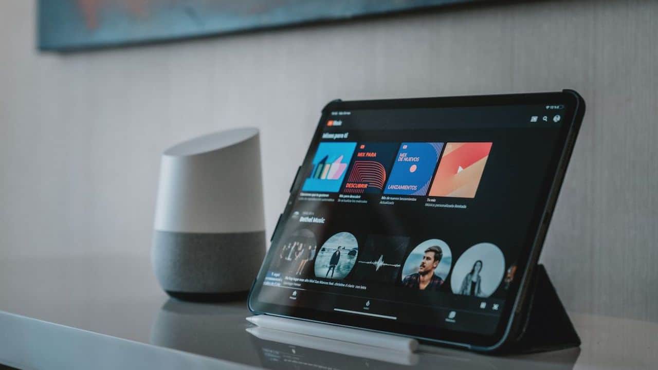
As announced at I / O 2022, Google is optimizing its Android apps for tablets and other large-screen devices. YouTube Musicfor example, she has already done the redesign of the playlist design, but now she seems ready to redesign the user interface as far as album viewing is concerned. So here are the news that we could soon see on the platform.
YouTube Music: the App will have a new interface for viewing albums
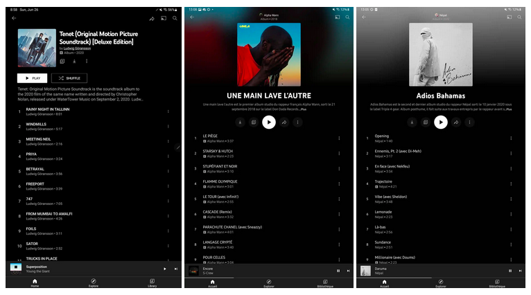
These days the YouTube Music App has redesigned the graphic interface of the viewing albums. This means Android users will now see the album cover bigger than has happened so far, complete with title and description clearly visible. The same screen then offers a series of useful functions to the user. Here you will find downloading, adding to library, playing, sharing and an overflow menu. Also, as you can see in the image below, the interface adds a track list. When viewed on a tablet, it appears on the right, leaving all other information in the left column.

Clearly these are changes that are slowly coming to the application, but what matters is that finally the YouTube Music App also has a graphical interface that adapts to large screens. In short, this is a very sensible redesign, even if it seems that it has not yet arrived on all Android devices. Indeed, it must be said that it will arrive shortly, but will not affect iOS devices instead. So, Android users, consider yourself more than lucky.


Leave a Reply
View Comments