We tested for this Nothing Phone (1) review, one of the most anticipated smartphones of the year. For Carl Pei’s company’s marketing prowess, which generated unprecedented ‘hype’ by revealing a few details at a time. But also why there is no phone like that of Nothing. A mid-range Android smartphone that, to stand out from the others, relies on a original design. Made of transparent glass and LED lightsable to communicate even without turning on the screen.
A simple and “familiar” smartphone in many ways, but original and unique in others. In this review we tell you about the strengths and limitations of Nothing Phone (1), to understand if it could be the right choice for you.
Our review of Nothing Phone (1)
The Nothing Phone package (1) delivered to us for this review immediately shows the originality of the smartphone. Flat and wide, it is made entirely of easily recyclable cardboard. Inside found only smartphones, a USB-C / USB-C cable and documentation (as well as a pin to open the SIM compartment). No chargeralthough we were able to test the 45W fast charging one provided by Nothing separately, as well as the original transparent plastic cover.
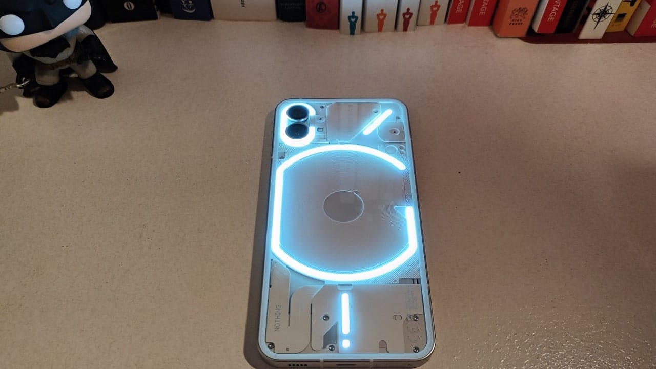
Once removed from its packaging, Nothing’s smartphone immediately shows its uniqueness. But also something familiar. The front and back are covered with vetro Corning Gorilla Glass 5but it is the rear that attracts the eye, even when turned off.
The transparent design allows you to see the LEDs that make up the Glyph Interface. But we also loved being able to see some of the vines and small ones components inside the smartphone. Even where they are not seen directly, the components are recalled: this is the case of the central circle that indicates the cables for wireless charging. Interesting too see the “three-dimensionality” of this design: you can see that some elements are in relief, so much so that by paying attention you can also catch some shadows under the body of the smartphone. Something that no other smartphone has.
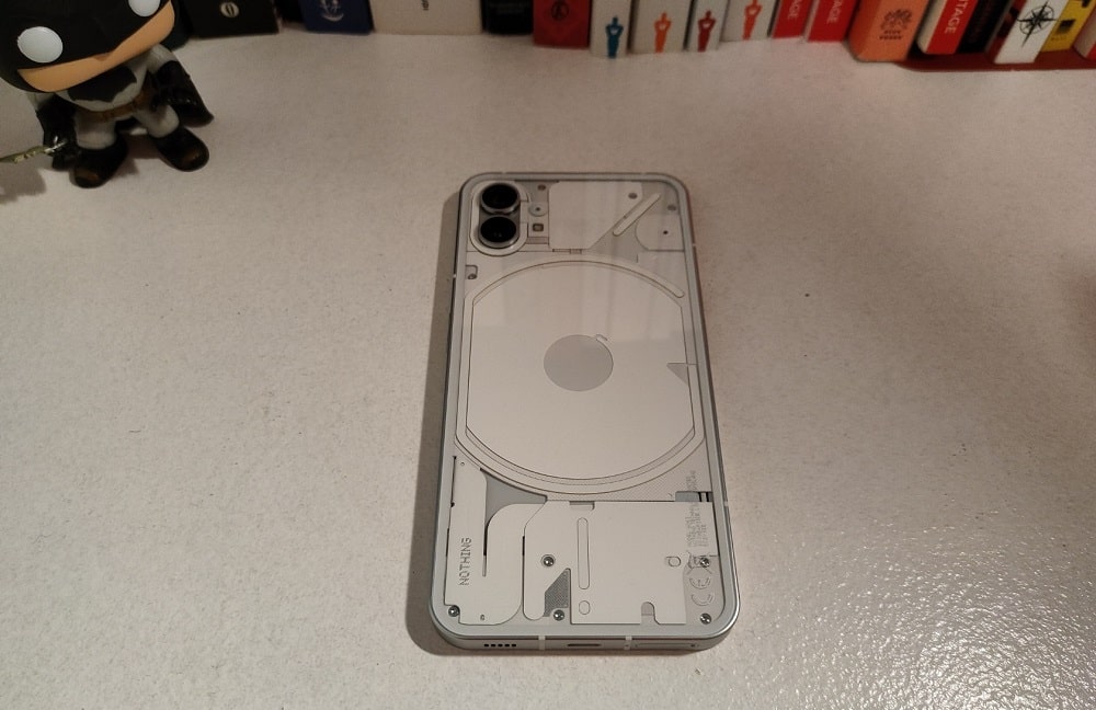
Those who like us touch different smartphones to do reviews and tests, can only be impressed when finally there is a really different device, even before turning it on. But it also more easily notices the less original elements, such as the square profile but with rounded corners in aluminum which is very reminiscent of the iPhone. But that’s not a shame: the result is elegant and simple. If “upside down” Nothing Phone (1) is the most particular smartphone on the marketturning it to the other side shows a simple and minimalist design. Two different souls, which adapt to any situation.
In the right frame you will find the unlock / power button, while on the left the two volume keys. All are well made, with a Loud and satisfying ‘click’. Below the SIM tray and the USB-C input. Both above and below, stereo speakers which, although not exceptional, proved to be of excellent quality during the tests.
Lo 8.3 mm thick and 193.5 grams weight they don’t make it quite the lightest of smartphones. But holding it in our hand didn’t feel particularly bulky or heavy. The construction is undoubtedly of good quality: although you can see some internal components, the perceived solidity between the hands is excellent. The only ‘negative’ of the design is the IP53 certificationwhich means it will withstand light rain but not a submersion in water.
The design is the “selling point” of this smartphone and Nothing caught us in full. It manages to balance elegant simplicity with that truly unique transparency.
A very nice screen
If after the presentation we expected to be amazed by the design, the Nothing Phone’s display (1) surprised us positively. The company chose a display 6.55-inch flexible OLED. Flexible panels cost more and are not usually used on a flat screen device like this one. But with this decision Nothing was able to guarantee that the frames on all four sides were thin and of equal size. Something that most users will not consciously notice but which contributes to the premium feel of the screen.
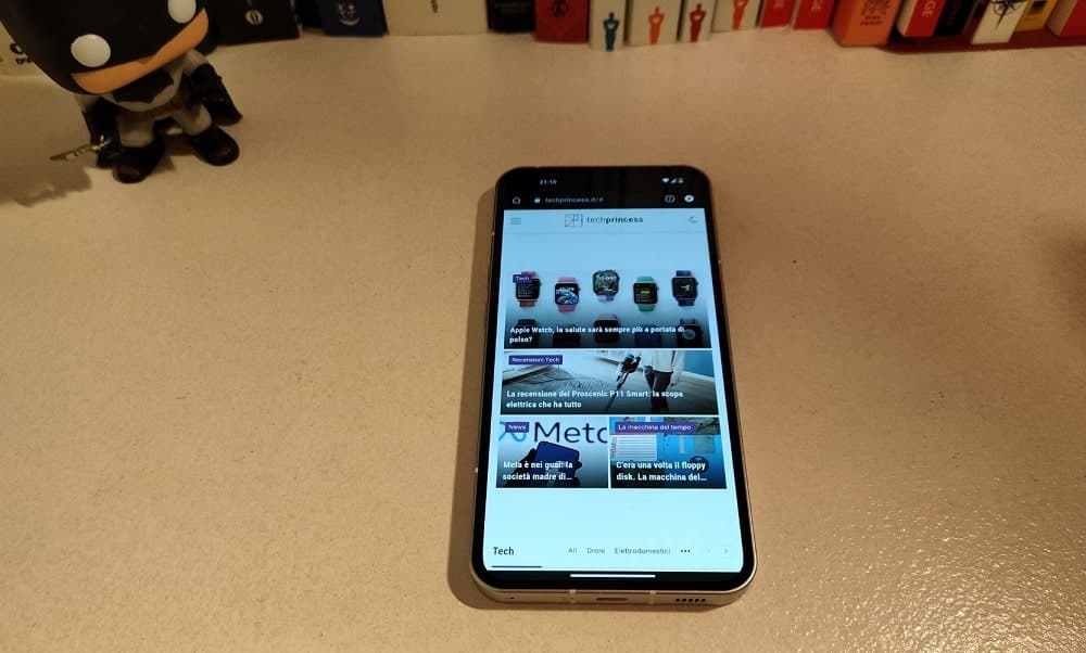
The resolution from 2,400 × 1,080, with 402 ppi pixel density guarantees high quality both in streaming content and also simply by navigating the various menus. The OLED technology then has, as we know, absolute blacks and an infinite contrast, and with the 10 bit color and HDR10+ viewing content is truly majestic.
We also like the brightness, which touches point of 1200 nights making it easy to use the smartphone even outdoors. The frequency from 120Hz (which also adapts to 60Hz depending on the content) makes navigation fluid and games more ‘natural’ (which thanks to the 240Hz touch sampling work very well).
While there are some 165Hz refresh rate gaming phones and other ultra-premium smartphone solutions that cost twice as much as Nothing Phone (1), this smartphone has nothing to envy to most top-of-the-range displays. As we will see, Nothing spared other elements but it did screen is definitely of high quality.
Last note for the display: the fingerprint sensor under the screen. It works fast and without any problems (and in this price range unfortunately it is not yet normal). Passed with full marks.
Performance: what you need, no frills
Nothing has partnered with Qualcomm to equip this smartphone with a processor Snapdragon 778G+, a modified version of last year’s chip to support wireless charging. We tested the version with 8GB of LPDDR5 RAM (although you can choose the one from 12GB) e 256GB of memory UFS 3.1 (there is also from 128GB).
Performance is solid – the apps all open very fast and work great. 8GB of RAM is more than enough to open multiple apps at the same time and quickly switch between them. Don’t expect gaming phone performance, but you can also play for medium to long sections without noticing slowdowns. The temperature remains under controleven with heavy use.
Here are the benchmarks that are in line with what you can expect from a mid-range chip from last year: good but certainly not exceptional.
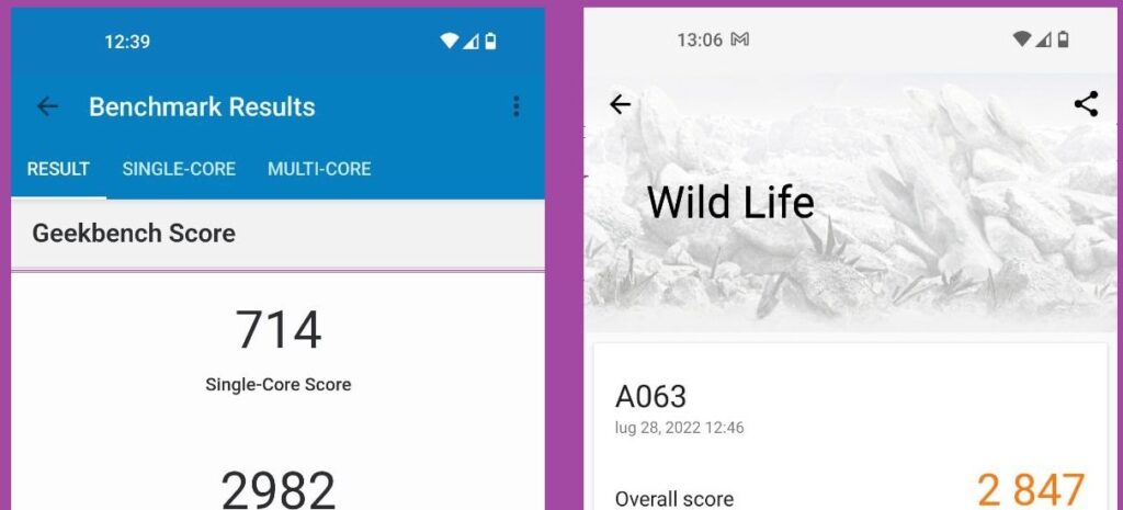
In daily use you shouldn’t have any problems and the energy management did not disappoint us. In this price range you will also find products with higher-end chips, capable of truly exceptional performance. But for most users it’s too much. If you use your smartphone for calls and chats, social media and streaming, with a few moments dedicated to gaming, you will be satisfied.
Also because the very lean software helps a lot the overall performance of this smartphone.
Nothing OS and glyphs: style makes the difference
The operating system Nothing OS based on Android 12 has fully convinced us. Not so much for what it offers more, but for the fact that there is nothing beyond what is necessary. Indeed experience is the closest to the ‘stock’ version of Android we have seen (like the Pixels).
No more apps than necessary, just the basic ones to make your Android smartphone work at its best. The novelties are almost exclusively aesthetic. There are a couple of clock and weather widget with the same ‘industrial’ style as the phone, the app Recorder has a design that recalls the aesthetics of the phone. For the rest, you only have the option of using a widget to show your NFTs if you connect a crypto wallet. But if you don’t have it, no annoying apps that steal resources or any other type of bloatware.
This way you can download only the apps you need. We have passed those of our ‘daily’ smartphone in a very simple way: Android 12’s setup is particularly simple. Anyone can start and prepare this phone and there is no app or service to block, which we wish was something shared by all smartphones. But unfortunately Nothing Phone (1) is (almost) unique in this too.
The only big news in everyday use is the Glyph Interface.
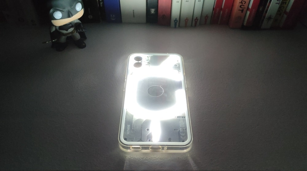
I 9000 LED on the back of the smartphone are mainly used to show the arrival of calls and notifications when the smartphone is turned around. You can customize ringtones (they all sound very ‘robotic’) with particular light sequencesthe. And there is also the option to show different ringtones and glyphs for special contacts in the address book. But at the moment you cannot differentiate the notifications.
The Glyph Interface also shows the charging status when you connect your smartphone. And you can also use them as alternative to flash when taking pictures. In the camera settings you can also activate a red flashing indicator when you record a video, which gives a really gorgeous retro taste.
Many commentators have called these rear LEDs useless. And actually our natural inclination is to place the smartphone on the desk with the screen facing upwards (when we don’t have it in our pocket). But the fact that they have not become fundamental after using a few days that we have made them it does not mean that they are a novelty that we will appreciate over time.
And then they are fun, new and a way to start a conversation: once activated they will all ask you how they work. I am a cextra hints on a really solid phone. And if you get tired, any cover can …






Leave a Reply
View Comments