Nothing returns to the market with a new smartphone full of style — and this time it’s aiming for mid range. The new Nothing Phone (2a)which we tested for a few days in preview to be able to tell you about it in this review, in fact starts from 349 euro for the basic 8+128GB version and reaches 399 euro for the 12+256GB model we tested. And despite giving up something (for example, abandoning glass and aluminum for plastic), it keeps it intact its attention to design and many interesting features. But a few too many flaws — and fierce competition in this price range — make it a product that it’s not for everyone. This smartphone, however, like its “big brothers” has character. And it could become the right compromise for many.
Our review of Nothing Phone (2nd)
Over the last year and a half, we have tried all the smartphones launched by Nothing (and even some of the brand’s earphones). After the debut of Nothing Phone (1)the company co-founded by Carl Pei has been able to perfect its recipe of style and functionality with Nothing Phone (2). Now the challenge is to bring everything the company has learned to a lower price range. An operation which, as we will see, was not successful in all departments. But it surprised us in some ways.
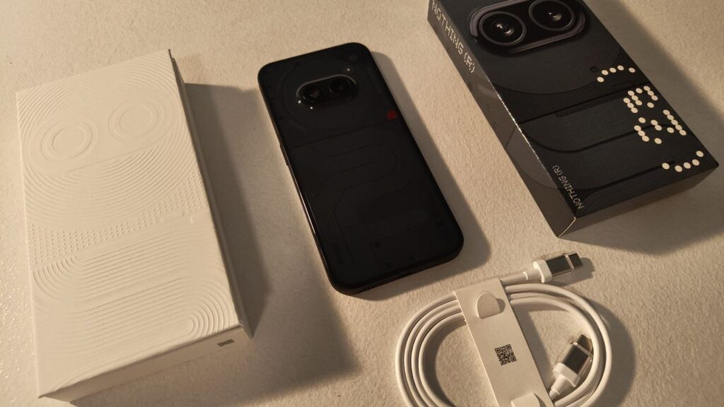
First of all, because the company manages to show the same attention to detail starting from the packaging. Which, in addition to being sustainable and easily recyclable, immediately manages to make people perceive that it is a phone full of character. Even if the package itself is not exactly full: the only accessory present is the cavo USB-C/USB-Cwhich however has transparent attacks as we had seen in Phone 2.
Transparent and detail-oriented design
Nothing could only retain the most iconic feature of its smartphones: the transparent back, which also shows construction details on the outside. But it was able to distinguish the line of this mid-range smartphone compared to the two previous models, while keeping the constructive idea behind each choice intact.
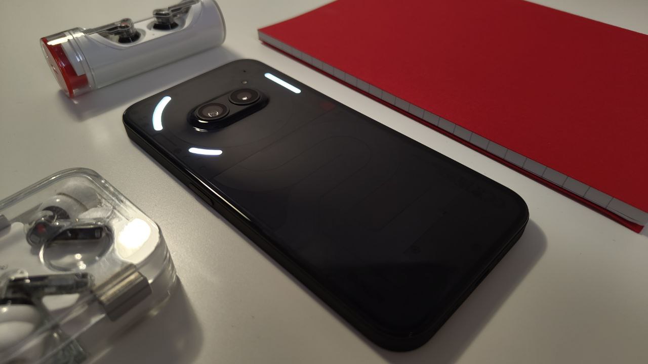
The most original element is in the highest part of the back of this smartphone, separated by a clear line of demarcation from the back of the body. This “head” is intact two cameras placed horizontally, with a raised plastic cover without edges and which does not make the smartphone wobble even if you use it placed on the desk or a table. Around we see the circle of bobina NFCwhich not only makes it easy to understand some parts of the smartphone to use in payments, but resembles a stylized head with two eyes in the center.
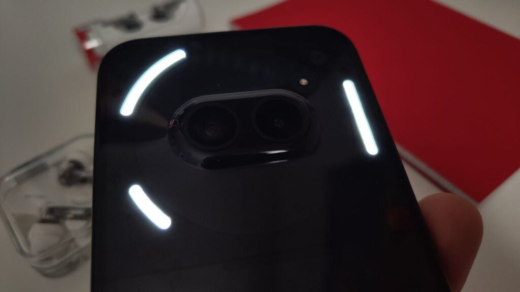
In this part of the smartphone we find three LED strips for the Glyph Interface, this too is now an iconic element of Nothing phones. There are much fewer than those found on Nothing 2, but we are still able to use it in a similar way to see notifications, as a flashlight or for advanced functions such as tracking Ubers. We rarely use these more advanced features. But the light notifications are something extra that we have learned to appreciate. And the three LED strips of Nothing Phone (2a) are enough for this.
Further down, the smartphone focuses on asymmetry with a series of transparent components that follow a sinuous path. The Nothing team explains that they took inspiration from Massimo Vignelli’s New York subway map. We only know that we like the look, also because Nothing played well with volumes and we appreciate the three-dimensionality. And then being able to see the screws and spaces under the cover gives a touch of originality that we really like.
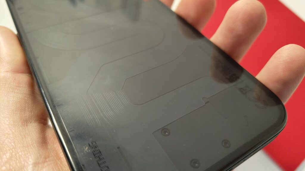
Holding the phone in our hands, perhaps because we are used to trying many smartphones during the year, we realize that the materials are less “noble” than the top of the range ones. But Nothing’s style allows you to make up for it. And although it doesn’t have that “wow” effect of Nothing 2, gets noticed.
Sustainable and resistant
Nothing tells us that the Phone (2a) we tested for this review has a lower environmental footprint than any of its other smartphones. And it even has used the plastic discarded in the production of Ear earphones (2) to build it. In total, 50% of the plastic comes from sustainable sources, and Nothing recycled aluminum, copper and other metal elements to make the smartphone. This doesn’t change our opinion on everyday use, but we’re happy to know it.
The smartphone, with its smooth plastic cover, retains fingerprints more than we would like. But it also gives a great feeling of robustness: it seems less delicate when we hold it in our hand. And with a weight of 190 grams, it is lighter than the Phone 2 and more manageable (although it is the same size, with 161.74 mm in height, 76.32 in width and 8.55 in thickness). Unfortunately, the IP54 protection from dust and water it is not at the level of the top of the range.
We also enjoyed it the slightly rough edge, also made of plastic, which makes it easier to have a firm grip on the phone. You will find the power button on the right and the volume buttons on the left. At the bottom there is space for the SIM and USB-C, as well as one of the two stereo speakers (the other is above the display, at the top). By the way: good audio, which comes in at a decent volume — but nothing exceptional.
Quality display
Il 6.7-inch AMOLED flexible display convinced us right away. Although, as the price increases, you can find products with a greater visual impact, in this price range it defends itself very well. It has a resolution from 1084×2412 (394 PPI)which perhaps won’t please the most expert eye — but thanks to good color rendering and the adaptive refresh rate from 30 to 120 Hzallowed us to enjoy videos and TV series without problems.
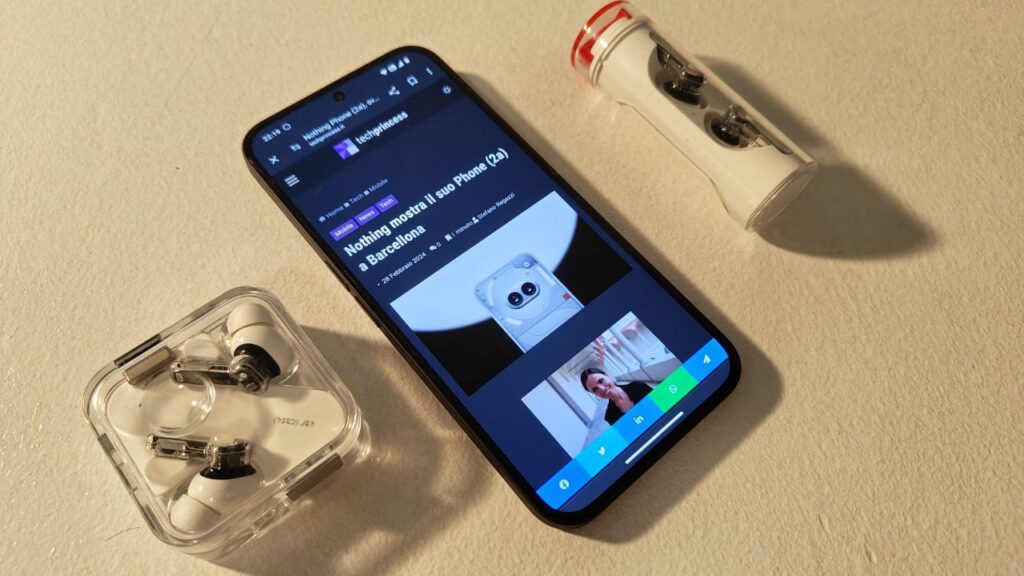
Good peak brightness 1300 nits, which the (little) sun of these days of testing was unable to affect. And we appreciate the fact that the frames are perfectly symmetrical on all sides, as seen in Phone (2). An attention to detail that, in our opinion, pays off. The cut-out for the camera at the top is also very discreet.
Below the screen you will also find the fingerprint reader, which seemed rather reliable to us, albeit with some understandable uncertainty in a light rain. The tactile engine when typing is also good, giving us good feedback.
Nothing Phone review (2nd): performance and software
Powering the system we find a processor Mediatekil Dimensity 7200 Pro customized just for this phone. For this review we tested the version of Nothing Phone (2a) with 12GB of RAM, supported by 256GB of memory. There is also a system dissipation and cooling system, to improve performance. Nothing has also worked with Mediatek for optimizations such as Smart Clean to speed up writing and reading on memory, as well as AdaptiveNTFS to speed up file transfers with Windows. But what is the result in everyday use?
We do not have the generally responsive system, even with some uncertainty in managing some apps. Although most of the problems concern the app Camera, and we think they are software problems — we’ll talk about them in the dedicated section. The benchmarks are positive and the use during games, even the more graphically demanding ones like Genshin Impact, went very well. The system seems reliable to us and the phone does not heat up.
The protagonist, however, remains Nothing OSwhich reached version 2.5 with Android 14. We really like the minimalist style, with a clear graphic identity, the possibility of deciding the size of the icons and many widgets well thought out in terms of graphics and functionality. As we were saying, some uncertainty happens from time to time. But Nothing usually updates its software fairly regularly, and will continue to do so for the next three years (plus an additional year of security patches). In our opinion it is worth it to have an experience similar to “basic” Android, but with a lot more character.
Camera: we expected more solidity
Nothing once again focuses on a dual photographic sensor, both 50MP: a 1/1.56″ main sensor, focus at 1.88 and both OIS and EIS stabilization, plus a 1/2.76″ ultrawide sensor and F2.2, with a 114-degree angle.
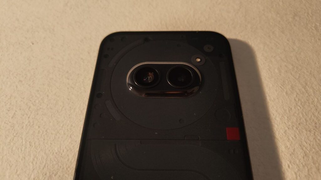
These sensors ensure good quality in details, especially in good light conditions. Even if the main one handles nuances better than the wide angle, it seems much better than average in this price range, where the difference between the main and the ultrawide is almost always abysmal.
Color rendering is good, although perhaps the camera tends to inflate the contrast a little too much compared to what we see in reality — especially using Ultra XDR, the new advanced HDR co-developed with Google. But it’s usually a tactic that pays off in terms of making an impact on social media, and in any case you can shoot manually or edit the image to fix it, if it’s not to your taste.
Above average 32MP front camerawhich has excellent color rendering and good contrast management.
The real problem comes in software management, which we found frustrating at times. It happened that, after having lowered the brightness of a photograph to the minimum, the camera raised it on its own initiative when taking the shot, overexposing it. Or, we started shooting video during a match and, after zooming in to frame the kickoff, the shot froze, but still recorded audio. Our hope is…







Leave a Reply
View Comments