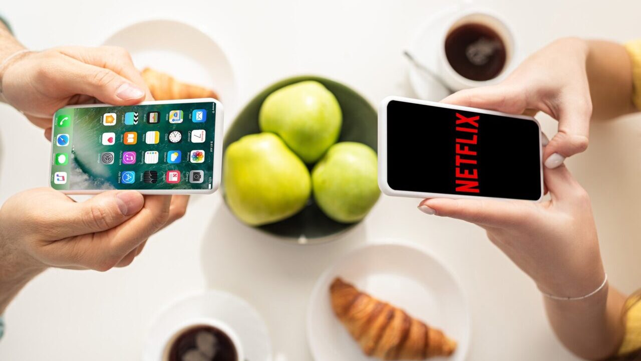
Netflix recently released a new update for the app on devices iOSintroducing different news for iPhone users. The update isn’t currently available to all European users, but a large number of iPhone owners in the US who have already updated the app have given us a first look at the latest additions.
See also Amazon Prime 30 days free!
How the Netflix app on iPhone changes
The phonearena.com portal reports that the home is now more immersive, catapulting the user directly into the latest additions to the catalog. The graphic interface has also been renewed with a new layout and, more generally, the fluidity of the application on the operating system has been improved.
A user named Janum Trivedi, who contributed to the new layout, has posted their Twitter a video in which you can appreciate what Netflix looks like on iPhone now. The post reads:
“Last year I led the revamp of the Netflix UI, to make it more fluid, pleasant and clean. Today that work has finally arrived”
This last year, I’ve been leading a UI refresh to make Netflix feel more fluid, delightful, and polished.
Today, all that work shipped!
Huge thanks to @nebson and @b3ll for helping bring this to life ❤️
Details below, but try it out yourself! pic.twitter.com/cZFb7c42Fd
— Janum Trivedi (@jmtrivedi) January 16, 2023
Among the innovations introduced we highlight:
- Home layout that reacts to the movement of the device, with new light effects that simulate the 3D of the posters
- Gradient in “paper” style on the posters of the titles in the catalogue
- Transition between titles that makes the experience interactive
- New animations and transitions


Leave a Reply
View Comments