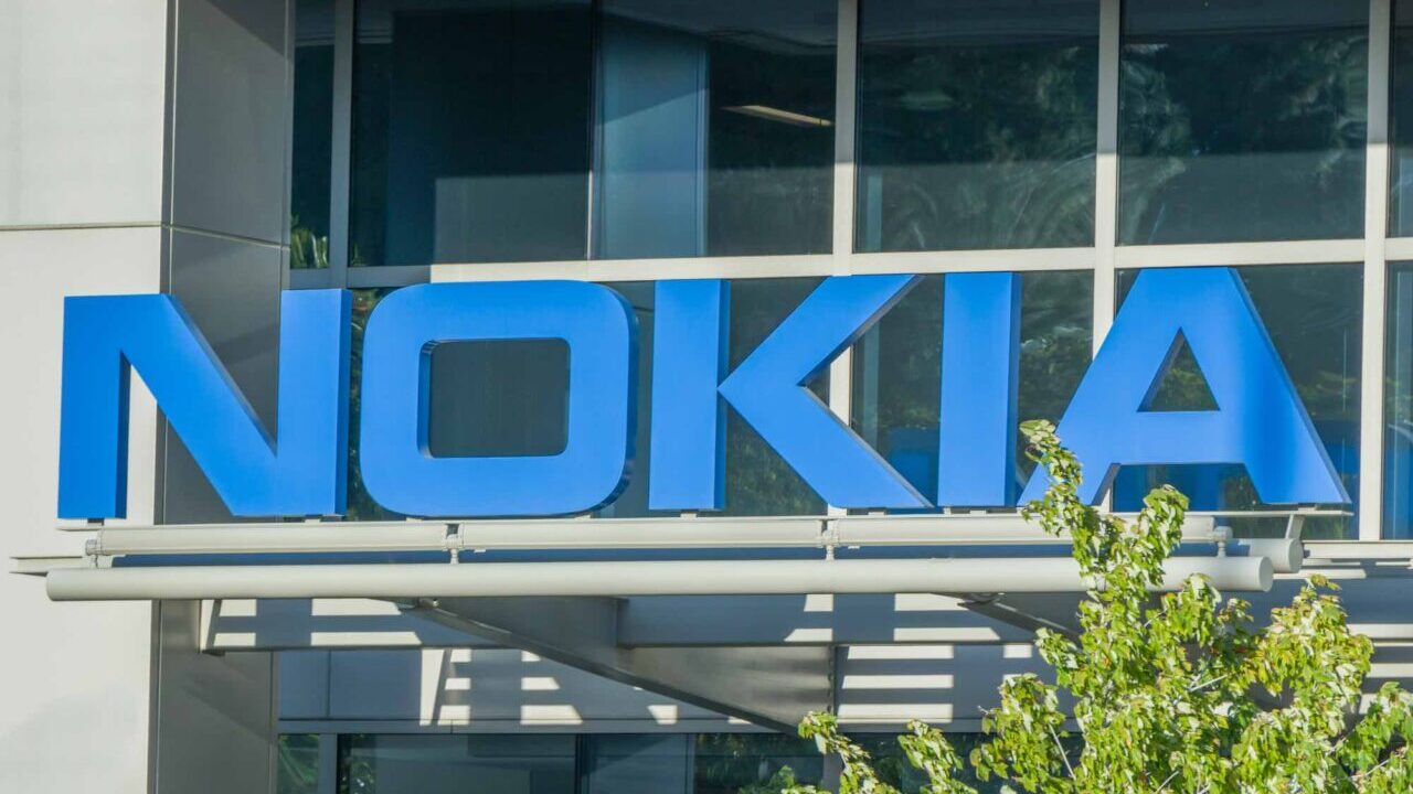
The historical logo of Nokia, that stylized writing we’ve known for years, is now about to change. The company’s rebranding process then begins, preceded by the appointment as CEO of Pekka Lundmarkand which will continue with a new strategic approach to the market.
After all, Lundmark had divided the entire corporate recovery plan into three phases: restore, accelerate and scale. After the first part, Nokia will now focus on acceleration, starting with its own brand identity.
What will the new Nokia logo look like?
As reported by Gsmarena, Nokia will definitely abandon the blue color. However, it is not clear what color solution it will adopt, even if it is likely that the new logo will have more colors inside. This would also represent the variety itself within the company, as Lundmark himself had announced that “Nokia is no longer just a smartphone brand, but an enterprise technology company”.
In the future Nokia, whose core business has always been mobile telephony, will mainly focus on business equipment. These include 5G network equipment, enterprise IoT solutions, and more. The brand would therefore aim to enter a market niche currently dominated by giants such as Microsoft and Amazon.


Leave a Reply
View Comments