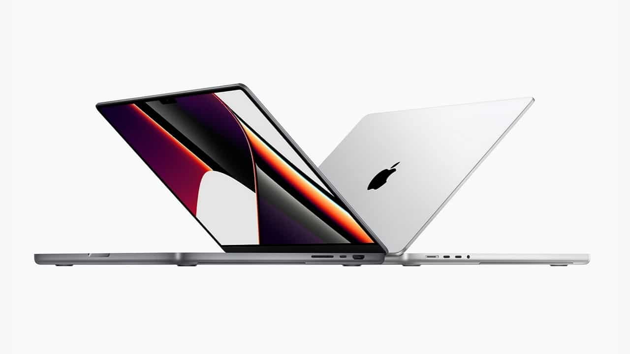
All’evento Unleashed Apple unveiled its new ones MacBook Pro 14 and 16 inches, which have several novelties compared to the latest models in this range. Among these, the most notable are certainly the new Silicon M1 Pro and Max chips, which we can’t wait to test: they promise to be truly exceptional. But there are also many important changes for professionals. A keyboard with more travel, more ports. And above all, the new ones MacBook Pro they no longer have the Touch Bar, introduced in 2016: why did Apple remove that novelty, returning to the “old” function keys?
MacBook Pro: why Apple took out the Touch Bar
When Apple unveiled the MacBook Pros from five years ago, it introduced a novelty that was unmatched in the market at the time. A small display above the keyboard, instead of the classic line of function keys. A touch display that could adapt to the different programs used by users. If they wanted to play a movie, they would see the images in full screen by holding the play / pause buttons on the Touch Bar. Anyone who was editing a video or song could keep the timeline on the small linear display for full screen editing.
The idea was to connect the huge success of the iPhone and iPad touchscreen with the classic laptop experience. A revolution that Apple seemed to really believe in. At least up to a point.
A brilliant idea, with few applications
The ability to offer a dynamic experience based on the work you were doing was really smart. Not only that: it was more intuitive. If the “power users” of macOS and also of Windows know by heart the sequences of the function keys for the most used programs, no one knows them for all. With the ability to have one schermo touch, the developers could have shown with an icon what that button did, instead of explaining it in an online wiki that no one reads. Not to mention that he could become one secondary screen for various operations (something that Asus has tried again “big” with the Zen Duo Pro).
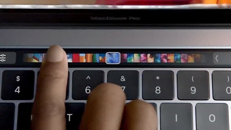
But unlike the function keys, the Touch Bar requires a lot more computer work. Those who develop applications should have created specific animations. And hardly anyone ever did. Not only that: even Apple has never really updated the features of this interactive bar in the following ones macOS updates.
After a few months from the launch, animated by many discussions among technology lovers about the effectiveness, usefulness and potential of the Touch Bar, we stopped talking about it. Cupertino not there advertised more with the same enthusiasm. Many used it to the bare minimum.
A great idea, what a fair number of users have found it useful over the years. But which many others found annoying. Especially those who spend eight or more hours typing on the keyboard now have every key stored in the muscle memory of the fingers. The interactivity of the Touch Bar, on the other hand, wants a conscious involvement, it requires look down and take your eyes off the main screen. Something that many professionals did not want to re-learn. (Although many of those who have learned to do this now can’t do without it anymore.)
The Touch Bar in MacBook Pros (and MacBook Pros only)
The first problem of many with the Touch Bar was immediate. Placed where they used to find function keys, many users they ended up touching her while they were typing more, or pressing keystrokes without thinking and being surprised to find a screen.
But you get used to everything (and many have). The real issue was that the technology was limited only to MacBook Pros. This meant, on the one hand, that for Apple itself as well as for developers it wasn’t always worthwhile investing for better implement the Touch Bar. On the other hand, the large audience of professionals who use laptops to work might not have been there more “patient” to learn the new technology.
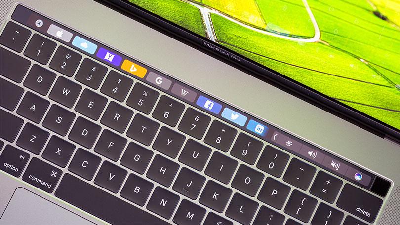
In fact, Apple has decided to go back on that decision. But not only on that. In addition to getting the old keys back, it also made them come back more door (like HDMI, even if only in version 2.0). It slightly increased the thickness of the laptop to allow for one keyboard with more travel, instead of the “butterfly” model.
In short, it has introduced (or re-introduced) some technologies more “classic” but appreciated by professionals. That Apple didn’t ask for the most innovative product: they wanted the best laptop, without the need for surprises and news. Apple listened, launching a laptop whose more big news is under the body: the new Silicon processors, which ensure a lot of power and above all an increase in autonomy.
Changes that are less likely to impress the average user. But the “Pro” in the name of the laptop stands for professionals. That they don’t want surprises but great reliability. The fact that Apple then adds a dream screen, feature-rich software and an ocean of services ensures Cupertino’s leadership in this field.
We are curious to find out how these new MacBook Pros perform in everyday life. And even if some users do will complain about the end of the Touch Bar, we don’t think Apple wants to bring it back to life anytime soon. What do you think about it? Are you a fan of the Touch Bar or have you never really used it? Let us know in the comments.





Leave a Reply
View Comments