At the gates of 2019 we had the opportunity to thoroughly test the latest software released by Phase One. Capture One 12 Pro is a new generation software that implements many new features within Capture One, bringing about a small revolution. Let’s find out the details in this review
Already with Capture One 11 we had in our hands a high level software for the post production of our photographs. Now Phase One has released the annual update of its software by including many new features. Many of these had been loudly requested by users. With Capture One 12 we are witnessing a “small revolution” in deraw software. But without getting lost in small talk, let’s get into the details in this review.
What changes? – Capture One 12 Pro | Review
Capture One Pro 12 is a substantial update that positively changes the experience of using the well-known Phase One software. The first thing that stands out is the interface. In fact, compared to version 11, icons, font sizes, the space between the tools and even the cursor have been updated. This had initially confused us, leaving us baffled for a moment: what was the use of making this change? The answer came a few hours later, noting how we didn’t feel fatigued at all even after processing the photos of an entire still life shoot.
The new graphics bring improvements that go to reduce eye fatigue during long sessions. We therefore wondered if this was not a placebo effect. We went back to using the previous version to process the same set of still life photographs. Meanwhile, we noticed that it took us longer to process the same photos (we’ll get to this shortly), secondly we found ourselves more tired during the processing and we took more breaks. The new interface is actually less tiring for the eyes, moreover using two monitors, as we have been used to for some time, the advantages grow even more.

Capture One 12 Pro

Capture One 11 Pro
It is easier to find the sliders, and the less intense color palette makes the user experience more immersive. Another significant change concerns the positioning of the menu items. Although the external skeleton has always remained the same, the items found within the drop-down menus are different. This too initially confused us, but then we quickly adapted to it. Furthermore, once defined the keyboard shortcuts (which has always been one of the strong points of Capture One Pro) we proceed with even greater speed. The new menu organization, among other things, makes it easier to customize shortcuts. The revolution of the interface has been promoted with flying colors and has only been able to bring improvements once the habits we carried with us from previous versions have been defeated.
Key Features – Capture One 12 Pro | Review
The overhaul of the interface is not the only renewed functionality within Capture One 12 Pro. Much emphasis has been placed on managing the masks, in particular Advanced features have been introduced that greatly improve the experience of use and management of the masks. Masks, which were already a strong point in version 11, see the addition of 3 key features:
- linear gradient mask;
- radial gradient mask;
- brightness masking.
How do we change the usage experience? Let’s start by saying that we can combine these features with the “old” features already present in Capture One 11 Pro. This opens up a sea of possibilities. But let’s go in order and try to understand how the new masks work. The big news is represented by the two variants of the gradient mask, these masks are vectorial and can be dynamically modified. In addition, you can define, as usual on Capture One Pro, a transparency for the layers.
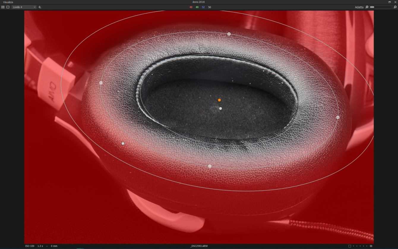
Radial gradient mask on Capture One 12 Pro
The mask can be adapted to the shape of the subject, this is because it is not circular but elliptical. This makes it very easy to prepare the right mask. Furthermore you can also invert the mask, keeping the vector nature of the same. The linear gradient mask, on the other hand, is very simple to use. You select the area of effect of the mask and this will decrease in intensity in a linear way. On the surface with both masks it may appear to be impossible to use non-symmetrical gradients. Yet even this is possible. Just use the luminosity masking tool.
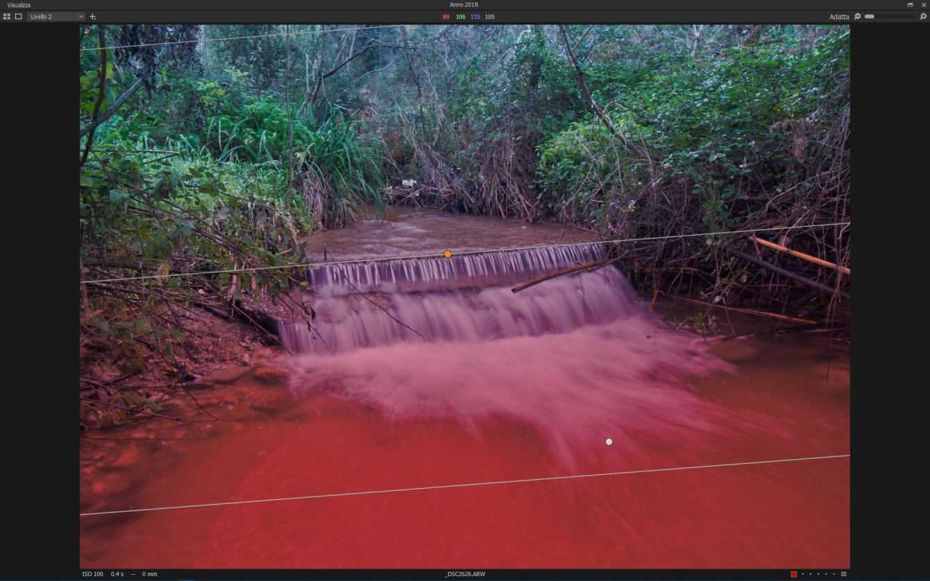
Linear Gradient Mask on Capture One 12 Pro
The brightness masking tool is probably the best feature of this release from a feature standpoint. Thanks to it we can modify our mask based on the luma value of the surfaces. As is well known, this value varies from 0 to 255, and in our selection we can also select a gradient in the passage from one luma level to another.
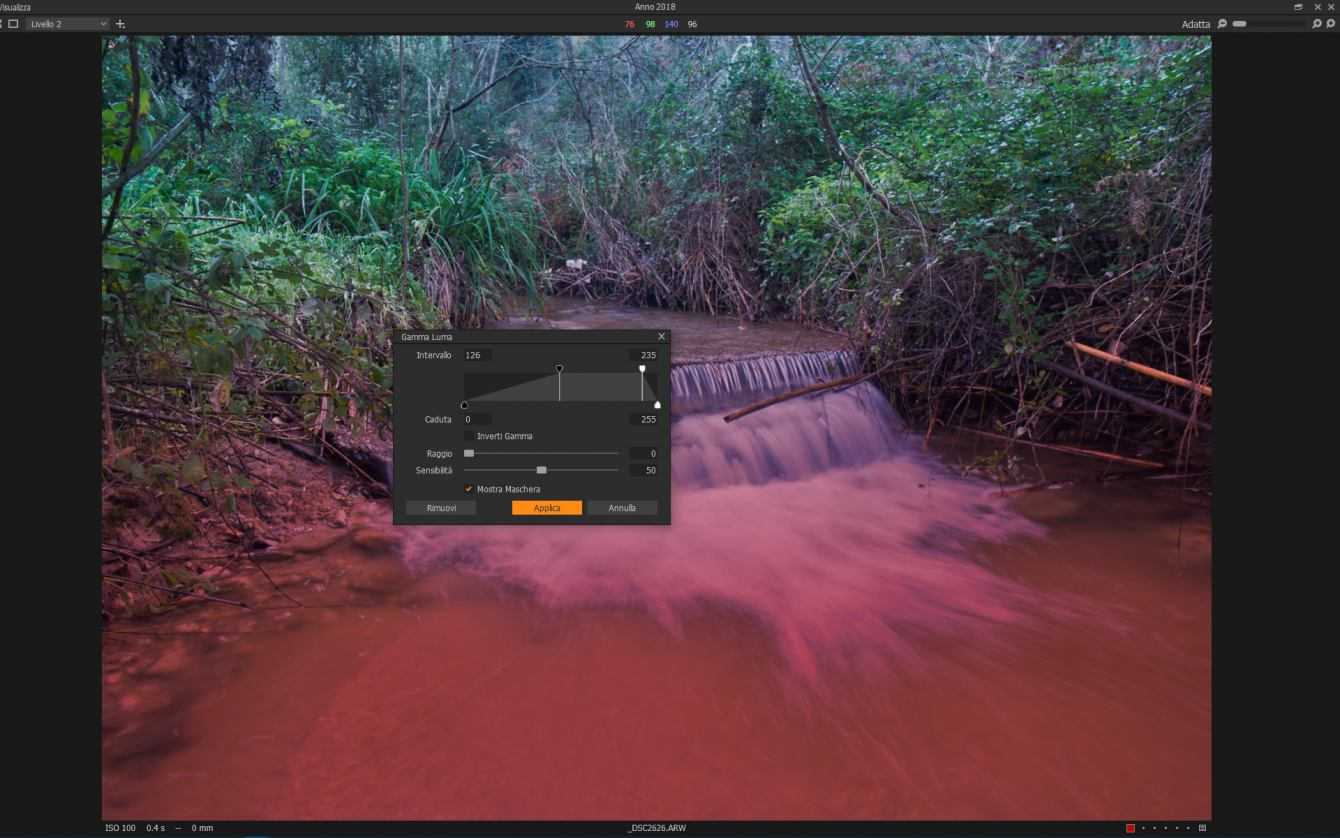
If this is not enough we can also work fine using the brush and the eraser. Just rasterize the mask and use these tools. In fact, luma masking works on any type of mask and can make the transition from areas with different lighting gradually in a fully automated way. In addition to this we always find the “refine” tool that softens the contours of the mask. This combination of tools therefore makes it very easy to create, modify and manage masks. On average, much less time is lost than the previous version, and the workflow becomes extremely lean and fast. Also remember that the presets can be applied selectively on the masks making everything even more interesting and opening the doors to infinite possibilities.
The under the hood improvements – Capture One 12 Pro | Review
With version 12 we also have an update of the Capture One engine. The version 12 engine implements various improvements from the point of view of color management algorithms. Added support for the latest cameras released on the market, and in particular, support extends to Fujifilm. The film simulations, characteristics of the Fuji brand, are available in a complete way. The reproduction is completely faithful to those that are in room profiles. In fact, Phase One and Fuji have collaborated to make available color profiles designed exclusively for the cameras of the house.
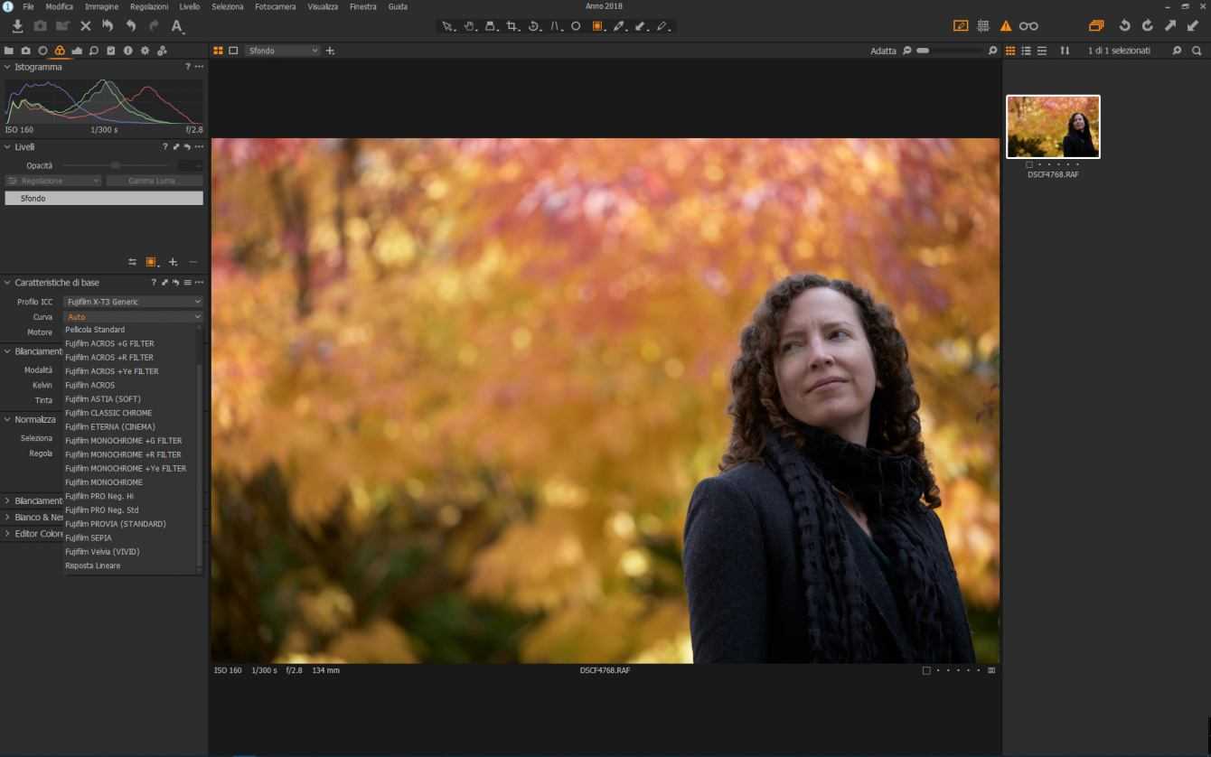
Fuji film simulations are available in basic characterization. Thanks to dpreview for the RAWs made publicly available
There are 16 film simulations in total and in the screen you can see what they are. There are no problems with handling RAWs. If you are interested we are available for demonstrations on how well the software works the Fuji RAWs. If you are interested send us an email. We then tested the operation of the new engine with the Phase One IQ3 files. The result impressed us, we noticed a decisive step forward in the program in bringing out the color shades of the post-produced photos. But above all the big difference lies in the time it takes to get the desired result.

5 minutes of post production on Capture One 12 Pro starting from a Phase One XF IQ3 file
The streamlined workflow is very surprising. The time savings makes Capture One 12 Pro a very suitable software for professionals and all those who have to manage a large amount of data. Among the advantages that we have noticed with Capture One 12 pro there is also the greater response speed of the software compared to the installed hardware. Even with IQ3’s hefty 100mpx files we didn’t experience any slowdowns even when drawing the masks. Which is a great result from our point of view.
In addition to this we point out the presence, finally, of plugins. Obviously at the present time, being the software recently released, there are not many third-party plugins. Regarding this, we reserve the right to calmly test its operation when we have some plugins available. In any case, we liked the idea very much, the opening of the Capture One Plugin SDK is a not insignificant added value to this excellent software.
Upgrade from version 11 – Capture One 12 Pro | Review
At this point of the review we come to what is a bit the worry of many in this period. Does it make sense to upgrade from version 11 Pro to version 12 Pro? It depends. The most important news concerns the masks and the support towards Fuji. If you use masks a lot or have a Fuji camera, the upgrade is mandatory. If, on the other hand, you can do without masks, and you don’t have Fuji, the situation becomes different. At that point what more does Capture One 12 Pro offer? fundamentally better color management, workflow, plugin support (when these will be available from third party manufacturers) and a revamped engine. Are they worth the price difference? definitely.
Even if you don’t currently use many masks in your workflow, with version 12 you will realize that managing them is so simple and effective that giving them up is just masochism. In our view, upgrade money is definitely money well spent. If you come from an even older version, like 10, there is really no doubt about it, it is an upgrade to do absolutely. If you have recently purchased Capture One 11 check for updates, you may be entitled to a free upgrade.

Capture One 12

Capture One 11
Please visit this link for uncompressed images. The ones reported in this review are all tablets so many of the color differences you may miss. To try the program we attach here the Phase One IQ3 RAW files (of which we have done the review). For Phase One IQ3 it is possible to develop RAWs for free with the version dedicated to this camera (this version will only open the RAWs of this camera).
Conclusions – Capture One 12 Pro | Review
We have come to the end of this intense review. Capture One 12 Pro turned out to be an excellent program for developing our photographs. We were already aware of this, having used both version 10 and version 11 assiduously in recent years. Capture One 12 managed to surprise us very positively thanks to the package of innovations it brings with it. Mask management, which was already a strength of Capture One 11 Pro, is now on the next level. As far as we are concerned, Phase One’s product is 2 spans above competitors’ products. Recommended? Yes, without reservations.
If you are looking for a software for the development of your RAWs, you cannot make a better choice, Capture One 12 Pro is the definitive answer to post production. Quick, fast and capable of being tailored to the needs of the user who uses it, Capture One 12 Pro is a complete software on every …


