It becomes more and more difficult to find physical buttons in new cars, replaced by touchscreen of large dimensions that become the operational center of the car: maccording to the tests the buttons are still the most effective. The Swedish publication We Car Owners tested the new large screens of 11 cars and compared them to a 2005 Volvo C70. And the results seem to prove the older generation right.
Physical keys on cars work better than touchscreens
Plenty of buyers wouldn’t even consider buying a car without it Android Auto o Apple CarPlay. Or at least equipped with an infotainment center all managed on a large touch screen. That’s about some vehicles like the Tesla Model 3 it becomes practically the only mode of interaction (or almost) with your own car, excluding steering wheel, gearbox and pedals.
But several experts over the years have argued that they risk being a distraction for drivers. And not just because it is possible to install videogame o Netflix on some of these operating systems. The problem is that the software interface doesn’t allow you to create amuscle memory on basic operations, which many drivers do even with the vehicle in motion. Turn on the air conditioning, heat the seats and more: with the touchscreens are more difficult to operate by continuing to look at the roadaccording to critics.
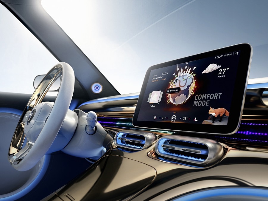
To test these claims, Vi Bilägare decided to test drivers with 11 new cars and a 2005 Volvo C70. time to get comfortable cwith the various settings of the cars, he asked to perform some simple commands on the car. And the result is clear.
The efficiency of the older generation
The Nordic publication asked the drivers to turn on the seat heating, increase the cabin temperature, switch on the defroster. And then yesadjust the radio, reset the navigation on the on-board computer, turn off the screen and dim the instruments.
The old Volvo he won without a fuss. VB explains that the drivers handled the four tasks within 10 secondswhile the car was traveling for 306 meters at 110 kilometers per hour. Most other cars took at least twice as long to complete the same actions.
Most users will always drive the same car, thus becoming more familiar with the infotainment system e decreasing the times to perform the actions. But the overwhelming result suggests that it is more natural for drivers to learn to use a car with physical keys rather than a touchscreen.
Why car manufacturers prefer touchscreens to physical keys
VB assigns the “blame” for the push towards the screens for a willingness to pursue a minimalist design by the houses. But it’s also true that being able to run more functionality on a touchscreen limits the builder’s need for design and then create physical keys and connect them to the various functionalities of the car. Furthermore it is undeniable driver’s request: more and more people want a great and well-made browser, they want to be able to use Spotify or similar to listen to music. A touchscreen solves multiple needs at the same time.
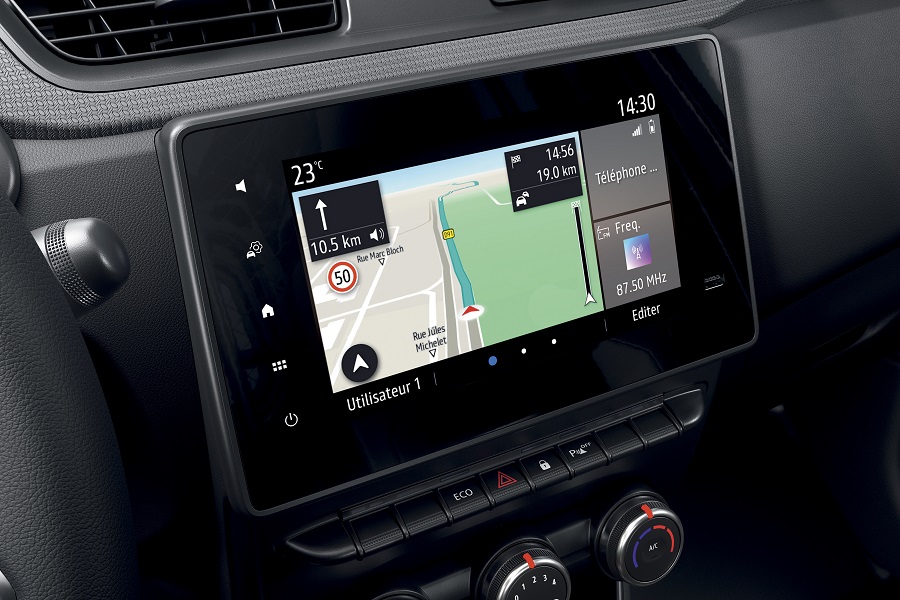 Renault Express Van 2021
And it must be said that not all the results of cars from the “big screen” are the same. There Tesla Model 3 It has practically no frets and performed well in VB tests. While the ID.3 in Volkswagen it did not have a good result, perhaps because of the capacitive screen. There BMW iX e Seat Leon they did better thanks to well-crafted controls, but according to VB they remain too complicated. While Dacia Sandero e Volvo C40 they have reduced the features to make them simpler, resulting in better results.
The infotainment system with touchscreen can therefore be made in a very different way, varying the results. And no doubt it plays in the old Volvo’s favor that almost all of these functions could be accomplished by touching one or two physical buttons. More complicated operations could have varied the results.
We find hard to think that auto manufacturers will go back on the touchscreen issue. But maybe tests like this suggest we might see some extra buttons for day to day operations, where they seem to work much better.
What do you think about it? Are you for Tesla-style minimalism or big, clear buttons? Let us know in the comments.





Leave a Reply
View Comments