EICMA changes its name and logo: the famous motorcycle fair, after the rebranding, is called: “International two-wheel exhibition”. All this shortly after 78th Edition of the event, to be held from 23 to 28 November at the facilities of Rho Fiera Milano.
The rebranding project led to a new graphic logo and a new name for the Fair. The new brand aims to be more intriguing, evocative ed international. The aim is obviously to summarize and strongly affirm the identity of the exhibition.
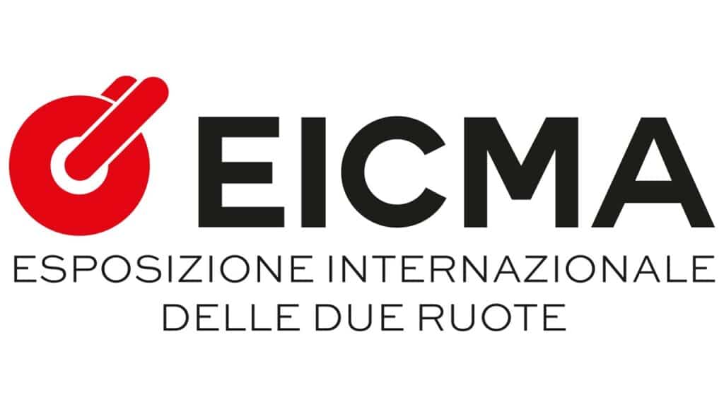
Red continues to be a leading color, able to express the passion for motorcycles. The circle and the fork are the other distinctive elements of the logo. The wheel symbolizes the world you travel in, while the fork represents control and mechanical components.
Paolo Magri, CEO of EICMA SpA defined the change as “a decisive change of pace, an innovation in respect of tradition”.
The words of the executives on the rebranding of EICMA
Yes Marini executives explain:
“So a current language, which allows you to capitalize on the historicity of an important brand and revitalize it, with impact and personality, in an elegant and harmonious visual synthesis that re-proposes the original and founding myth of the brand. A manifesto of values to establish renewed codes of engagement with its “followers”, who identify with it and who belong to a unique world full of passion, both adrenaline and mental. A brand identity, signed by contemporary and impactful graphics, which decisively and personality affirms the restart of EICMA towards the future of the brand and its mission “.
Paolo Biffi, CEO of the advertising agency, commented:
“The satisfaction of the whole team for having contributed to the renewal of the image of such an important event for the mobility industry and the community of users and enthusiasts, especially on the eve of an edition that promises to be so full of meaning and relevance “.




Leave a Reply
View Comments