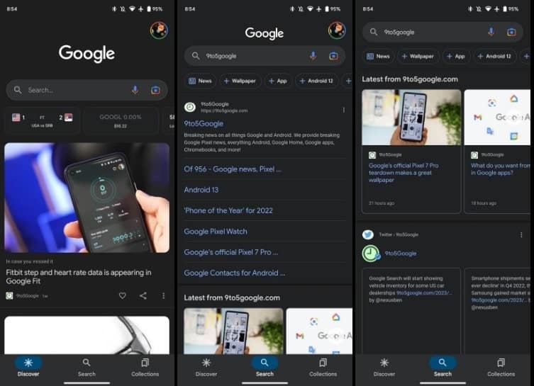
The Google app has undergone a design change in key Material You, with several new features that should simplify navigation. With new buttons on the bottom bar and changes in the settings, this is how the Google app changes.
The Google app changes design in Material You style
For starters, the Google app now uses a bottom bar more in line with Material You, complete with pill-shaped notification indicators. The icons are also combined with the new design to search filters. This is similar to what has been seen in all other applications of the Mountain View giant. However, does not use Dynamic Color, that matches the nuances of your operating system to your wallpaper image. Instead, the key between “Discover”, “Research” and “Collections” will be illuminated in blue.
Revolut: Your Online Account at your fingertips. Try Now
After Messages and Web, the Google app ranks last on Android a get a quick account switcher. In fact, just touch your profile avatar in the Google app to change the email used on your Android smartphone.

Credit: 9to5Google
In the popup that opens when clicking on your account, the theme provides a good visual separation between the various elements. The inner container houses the account selector, followed by Search history, Delete last 15 minutes, Reminders, Results about you and Reminders. Outside is a Google logo at the top, as well as your details in Search, Settings and Help and feedback below.
Finally, the Google app settings have been redesigned with one AMOLED black background when you use the dark theme. They’re not dissimilar to what’s seen on other Google apps in Material You. Below the pill-shaped search bar, there are no changes to the organization of menu items: General, Notifications, SafeSearch, My Results, Personalization, Google Assistant, Voice, Language & Region, Privacy & Security, and About.
These software innovations are already presenti in the latest beta version of the appbut soon they will also arrive in the stable version of the app.


Leave a Reply
View Comments