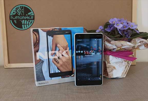
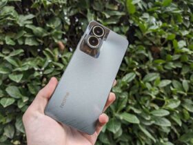
Buying an entry level device is almost always like hoping to do a lottery: you can try but success is never certain. Will Nokia 2.1 have been a lost bet or will it have managed to amaze us? Let’s find out in our review
Following a year of satisfaction at home Nokia, with the return in 2017 to the production of mobile phones with Android operating system, 2018 turns out to be just as interesting and in August the updated models of Nokia 2 e Nokia, ovvero Nokia 2.1 e Nokia 5.1. The abandonment of the series Lumia with Microsoft operating system it was certainly a choice that paid off the Finnish brand, especially thanks to the help of young company HMD Global who took it upon themselves to restore the Nokia brand to its old glory.
2018 opened with the announcement of 5 new devices that would come to replenish the ranks of smartphones. During the year, however, other variants of the previous models were also released with some not insignificant differences that make the user experience much more pleasant. In our review we will deal with Nokia 2.1, going to analyze in detail what is the new entry level of the Finnish company.
Nokia 2.1: let’s see the data sheet | Review
- Processor: Cortex-A53 Qualcomm Snapdragon 425 MSM8917 1.4 GHz Quad Core
- GPU: Adreno 308
- Internal memory: 8GB (expandable up to 128GB)
- RAM: 1 GB
- Display: 5.5 inch IPS LCD with 720 x 1280 pixel resolution, 9:16 (267 ppi)
- Rear camera: 8 MP AF f/2 con flash LED
- Front camera: 5 MP FF
- Networks: GSM: 850/900/1800/1900, LTE Cat. 4, 150 Mbps – DL/50 Mbps UL
- Connectivity: Bluetooth 4.2 con A2DP/LE / 802.11b/g/n /
- Connections: Jack Audio da 3.5 mm / Micro USB (USB 2.0)
- Sensors: Accelerometer, proximity sensor
- Battery: 4000 mAh
- Dimensions: 153.6 × 77.6 × 9.67 mm
- SO: Android 8.1 Oreo (Go Edition)
Nokia 2.1: let’s take a look at the design | Review
The smartphone arrives in our hands in a large box that is necessary to contain it together with a Micro-USB cable (in fact the Type-C input is not present) which can act as a connection with our PC, al battery charger to be connected to the home power line and to a pair of earphones marcati Nokia.
As soon as we picked up our smartphone, we felt a sense of solidity and robustness mainly due to the structure of the same it has dimensions equal to 153.6 × 77.6 × 9.67 mm, but all of his is also evident weight, equal to 174 g. The design is very common to that of other smartphones, with one plastic shell capable of providing excellent grip on the hand. The off button and the volume rocker are very solid and resistant, but at the same time they turn out to be comfortable to press and have a fairly high input speed. On the sides you can also see a decorative metal line that divides the smartphone exactly in two, giving the same high elegance despite the plastic that covers the whole back.
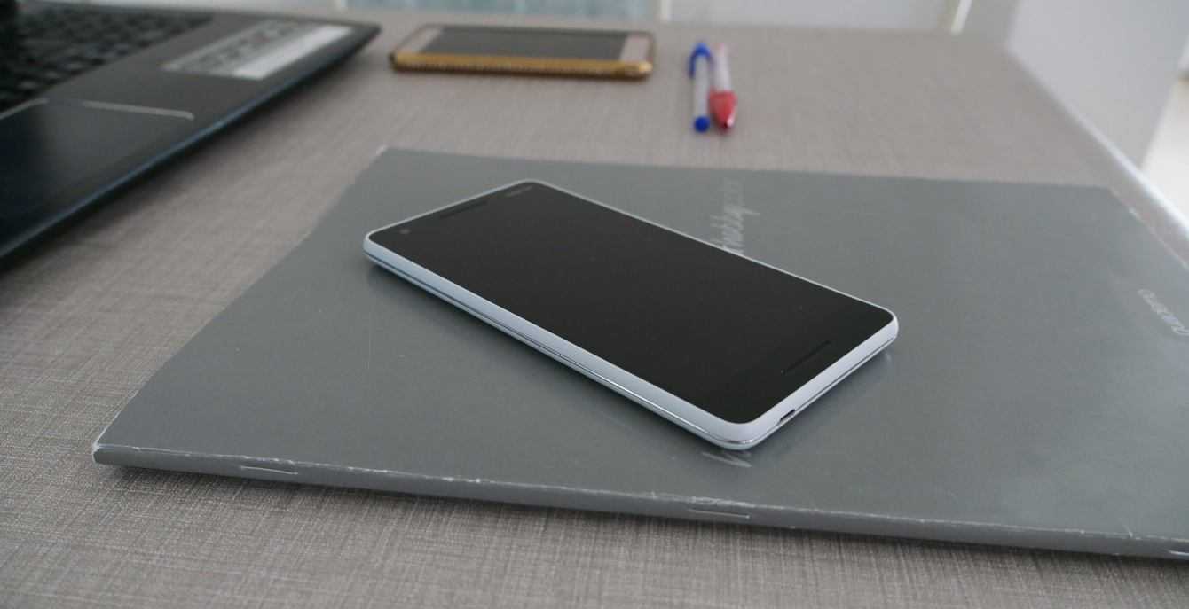
Front design | Nokia 2.1 review
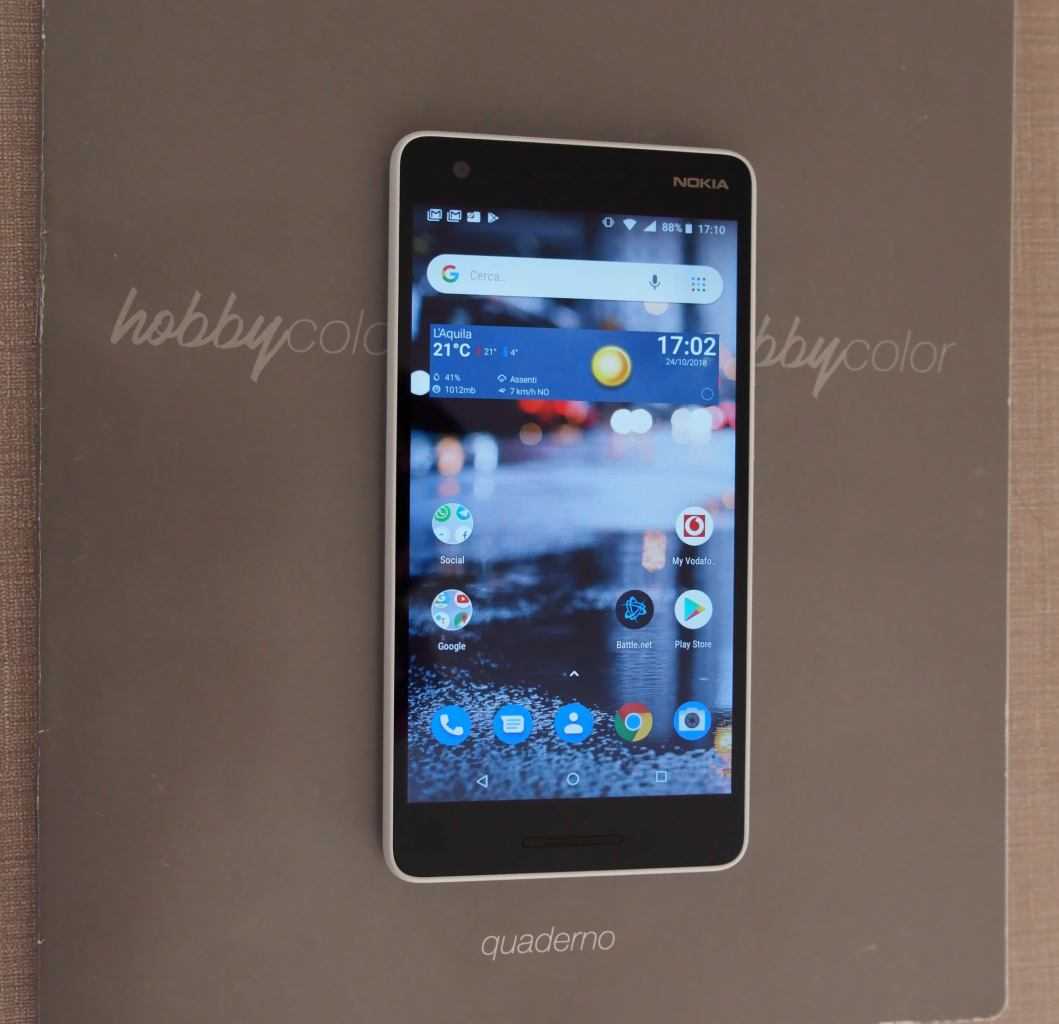
In the front there is a 5.5 inch IPS LCD display diagonal which provides a continuous solution with the rest of the body of the smartphone while not occupying it entirely. In fact, this choice differs from the latest standards that lead to increasingly larger screens such as to occupy the entire front part of the smartphone body. Moving our gaze slightly to the top we can immediately notice the 5 Megapixel front camera accompanied by proximity sensor. You may also notice the presence of a pair of audio speakers, placed both above and below the screen, to give a higher sound quality than direct competitors, providing us with a more immersive stereo experience.
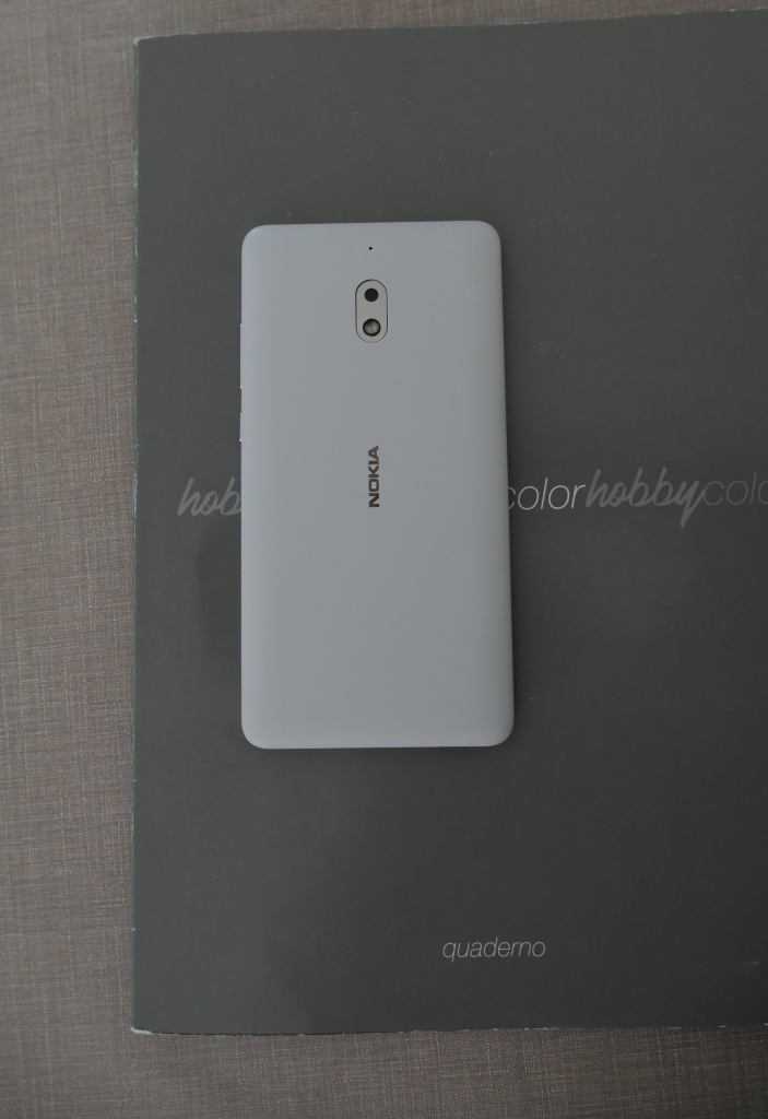
Back and side design | Nokia 2.1 review
On the back of the phone we can see the Nokia logo with the 8 MP AF f / 2 camera and LED flash placed at traffic lights on the vertical axis. On the side there are the off button and the volume rocker which, as mentioned above, are solid and resistant. One thing that immediately catches the eye is the absence of the compartment for the SIM and MicroSD. These will in fact go inserted (as in the old types of smartphones) in the back after removing the body.
Here we find the two slots for NanoSIMs e one dedicated to the MicroSD, very useful with this smartphone, which can expand the maximum memory of the mobile up to 128GB. This idea, although not in step with what is today’s standard, has been much appreciated since it takes away the hassle of having to carry the special key with us to open the side compartment in case of need.
Nokia 2.1: HD display does its job | Review
Our entry level is equipped with a 5.5-inch diagonal display, large enough to allow you to see a good video without missing any detail. The panel used is an IPS LCD equipped with a 720 x 1280 pixel resolution with a pixel density equal to 267 which certainly makes it great for the reference price range. The whole is protected by a glass Gorilla Glass.
The high pixel density allows you to have sharp and vivid images and the color rendering has nothing to envy to that of other devices equipped with FHD panels, but with an inadequate density. Of course, blacks and whites are not absolute and indeed, they are faded in some cases, but they still allow you to enjoy images with modest quality for everyday use.
The brightness is perhaps the most obvious strength of this panel. Although with the quality of images and videos it manages to defend itself adequately, it is with the brightness that it manages to unleash that hook capable of knocking out direct competitors in its price range. Even without raising the brightness to the maximum, in fact, we will be able to enjoy a good readability of the screen going to save some battery even if we are in full sun and maybe even wearing a pair of glasses with dark lenses. Although it has such a high brightness that we can see the images perfectly in the sun, even at night, lowering it to a minimum, we will be able to read on our display without any nuisance due to too strong light emission.
Nokia 2.1: RAM and ROM are certainly not crazy | Review
As expected, only 1 GB of RAM and 8 GB of internal memory (ROM) they are not a quantity to be proud of. Certainly the optimization of Android 8.1 Oreo (Go Edition) allows you to make the most of these technical specifications, optimizing both the space dedicated to the system which only occupies 2.5 GB of the 8 internal memory, both the use of RAM itself. This will disable some background applications just so as not to take up too much memory and to guarantee us a quick and easy use of our smartphone.
However with so little storage space you will not be able to install many apps if not the most essential. In addition, sometimes, we will not even have enough space to be able to update them, creating very annoying headaches. Obviously, the little space can be easily overcome by installing a MicroSD, but this operation, especially when the latter has a lot of data inside it, will dilate the loading times. going to slow down substantially what are the performance of the smartphone. So, in short, there is no solution that manages to remedy everything, as to have more memory we will sacrifice performance.
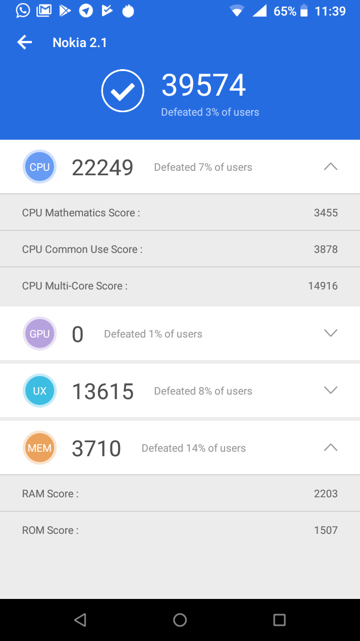
In spite of everything, however, our cell phone enjoys excellent fluidity precisely due to the optimization of the operating system. Of course, when used for basic functions such as messaging and calling, turns out to be an excellent mobile, but the limits of CPU, GPU and RAM will come to the surface as soon as you try to use some heavier app such as some games available on the Play Store.
Therefore, the CPU is also a unit Cortex-A53 Qualcomm Snapdragon 425 MSM8917 con quattro core da 1.4 GHz, it is certainly not the best performing in the field of processors. This model indeed was specially designed for low-end smartphones so as not to affect the final price too much. This particular beating heart is not suitable for processing very complex data, but it turns out to be anyway a good processor for messaging, for web browsing and for launching some games that do not require excellent computing skills. In short, mounted on a phone dedicated to something else would be a mediocre processor or worse, but for our entry level it turns out to be very adequate.
Nokia 2.1: the photographic sector leaves something to be desired | Review
Rear Camera | Nokia 2.1 review
The camera doesn’t look great either. In fact, in the presence of too much light the camera is unable to faithfully return the colors by going to burn the shot. Same argument, but inversely, can be said in the absence of adequate light. In fact, with little light the objective lens is unable to absorb the light sources present in the scene well, going to create very dark photos which can hardly be recovered even with post-production processes using professional software. The biggest problem, however, is when you have to take a picture using the flash. These in fact turn out to be completely white / gray with a bluish tint which makes the subject or the immortalized landscape virtually unrecognizable.
Although you have one resolution of 3264 x 2448 pixels the photos are lacking in details. Very often sharp shapes to our eye turn out to be blurry and the small objects blend together creating “color stains“Blurry. In other words, it is as if a nearsighted person were trying to see without glasses to try to catch every single leaf of a tree located about twenty meters away. In spite of everything, however, in adequate light conditions, you can get some nice photos that surely go to immortalize a particular moment that can therefore remain in our memories.
Front Camera | Nokia 2.1 review
Different, at least in part, is the speech regarding the front camera. Although it has a lower resolution, in some ways the quality of the photos appears to be slightly better compared to its rear counterpart. Even in the presence of inadequate lighting conditions, the photos are clear and, even if with colors a little darker than they should, they are still appreciable and worthy of sharing on social networks.
In the presence of too intense light, however, the situation changes. If the difference in level of light between us taking the selfie and the view (or perhaps the group of friends behind him) is too high, you will never find a way to take a decent photo. It will therefore have to be decided whether …


