The Italian car brand Lamborghini begins a new era with the restyling of the new logo and other innovations
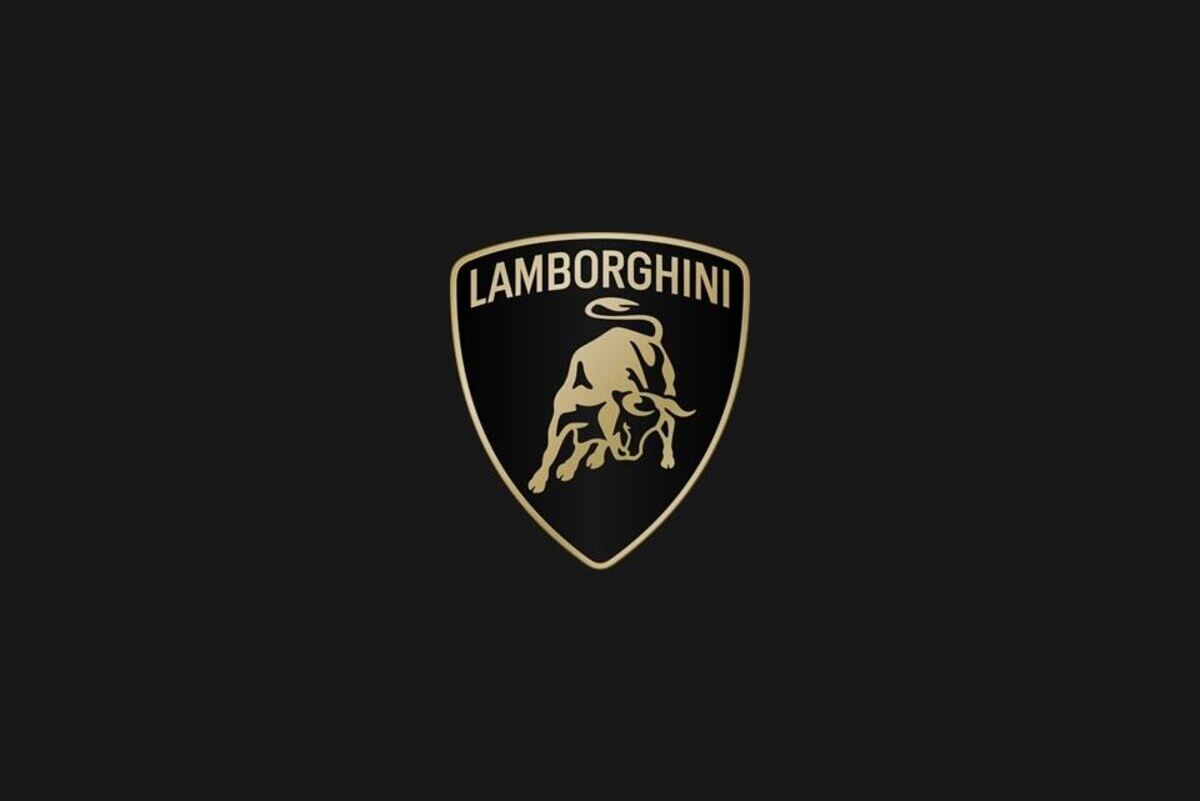
After more than 20 years since the last restyling, Lamborghini cars changes look by updating its historic logo. This change is followed by a new campaign that reflects the values of “Brave”, “Unexpected” and “Authentic” which harks back to the company's motto of “Guiding Human Beings Beyond”. Lamborghini is increasingly moving towards breaking down limits and conventions.
The restyling also copes with the graphic side of the brand, including a new official font which follows the distinctive lines of Lamborghini cars. All aimed at distinguishing the visual and non-visual identity of the company founded by Ferruccio Lamborghini in 1963.


Lamborghini is redoing its look: here is the new logo
Going into more detail, the new logo of the brand in orbit Audi it is the result of a process called Cor Tauri Management, aimed at pushing towards sustainability and decarbonisation. The Lamorghini writing appears larger and certainly colourful more minimal. White and black stand out as primary shades, while yellow and gold become accent colours. A revisitation that certainly has more wow effect from a visual point of view.
Even the iconic visiting, Lamborghini's distinctive symbol, undergoes a revisitation, detached from the classic shield to further accentuate its importance. All these innovations will be used by the Sant'Agata Bolognese company not only from the cultural point of view of the company but also of values. A new one also makes its debut icon set in collaboration with the Lamborghini Style Center which will be used for the first time on all digital touchpoints of the company.
And what do you think of the new logo chosen by Lamborghini? Follow us as always on techgameworld.com so as not to miss anything from the world of motors and beyond.


Leave a Reply
View Comments