Spotify is revamping the design of its interface, trying to look a little more like TikTok. But to tell the truth, also try to get some inspiration from Instagram and a little YouTube. Putting videos and podcasts at the centre, demonstrating that it wants to be much more than a simple audio player where you can listen to your favorite playlists.
Spotify refreshes its design – and mimics TikTok a bit
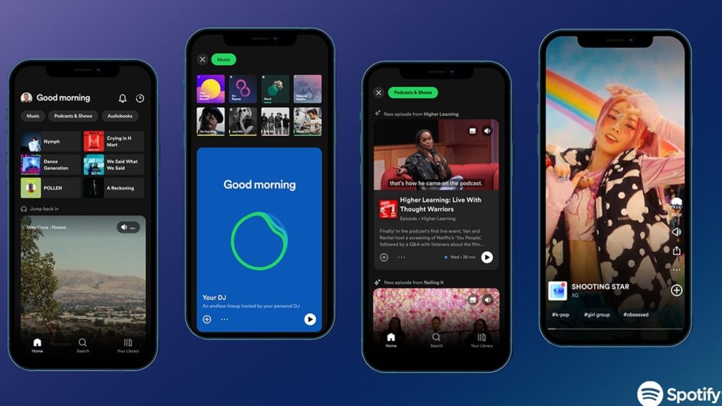
If you opened Spotify this morning to listen to a podcast or playlist on your way to school or at the office and thought you’d accidentally opened TikTok or another social network, you’re not alone. Spotify is in fact renovating the home screen of its app, trying to make it easier for users to find new content to listen to and watch. And the new design relies heavily on images and videos. And about vertical scrolling.
All features that are much more reminiscent of TikTok and Instagram, rather than the Spotify we were used to.
The revolution during the Stream On
The new look debuted at the Stream On event. And it proves once and for all that Spotify is changing its ways. Over the past few years, he’s invested heavily in podcasts, audiobooks, live audio, and more. It aims to be more than just a music app.

In the words of Spotify CEO Daniel Ek, Spotify wants to become “a home for content creators”, turning into a kind of YouTube for audio content. And given that YouTube too is becoming more and more social lately (especially with the Shorts), it seems that to become the YouTube of sound it must first become a little bit TikTok and Instagram.
Spotify is transforming itself to nudge people towards more differentiated and profitable content. Something that could make listening to the music you prefer more difficult. This new app design seems to create a dedicated space for all these new types of content. After years of Spotify trying to put podcasts, music and everything else side by side, it now seems to want to give each medium more room to breathe.
All the audio content you want

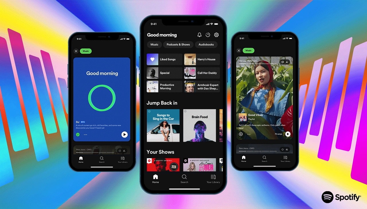
When you open Spotify, you’ll still see album art and playlists at the top. But below them, you may see a video podcast that starts automatically: just a tap to access. Or a photo as curated as an Instagram post tells you a particular story about your favorite playlist.
Choosing “Music” or “Podcast and show“, you will find a vertically scrolling feed that looks a lot more like Instagram Stories or TikTok compared to Spotify. Browse at will: each show or song starts automatically to give you a taste of the content.
Not all users will necessarily like the TikTok-style autoplay and vertical scrolling of Spotify’s new design. But other novelties could be liked instead. Like the Smart Shuffle feature, which will allow you to temporarily add different tracks to your playlists to make listening more varied. Or the virtual DJ, who creates playlists just for you.
These improvements should make it easier to discover not only new songs, but also new podcasts and audiobooks. Giving you a world of audio content at your fingertips – but scrolling vertically.


Leave a Reply
View Comments