
Achieved another goal for ufirst. The app that is revolutionizing the way people queue has in fact reached 5 thousand subscribers and, to celebrate, changes its look.
A new brand identity arrives for ufirst
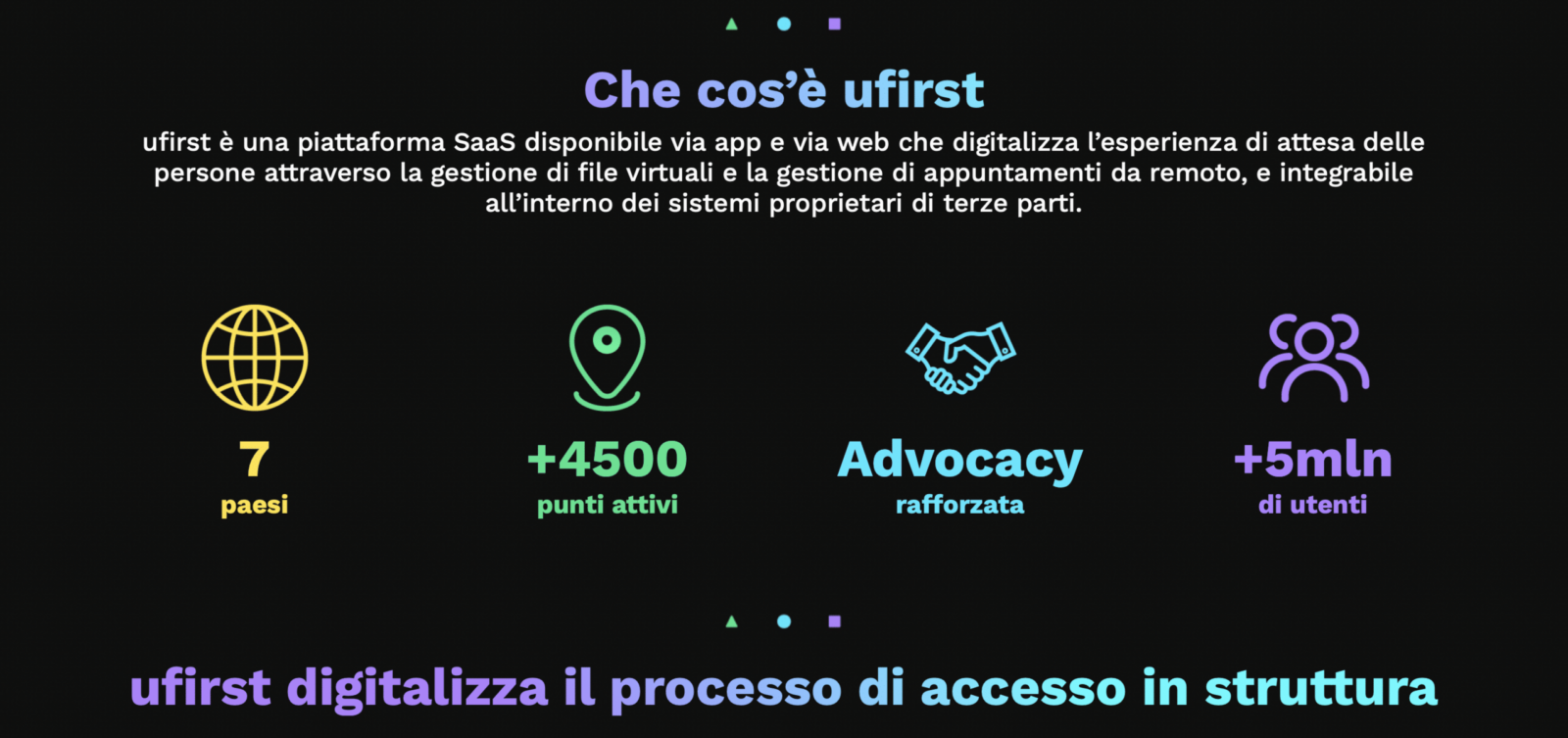
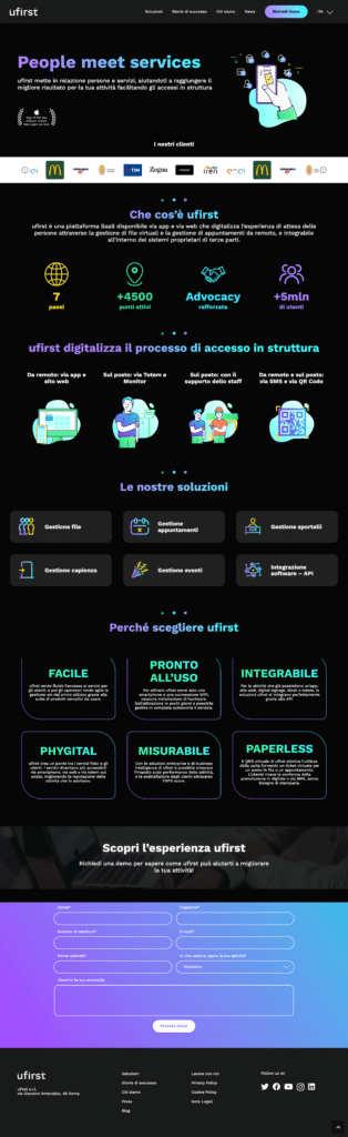
It does not seem to want to stop the growth of ufirst, an innovative app created to digitize access to the most congested services in the city. The platform has in fact reached the important milestone of 5 million users in Italy. This is a + 42% growth compared to March this year. To celebrate the goal achieved, the application has started by decided to carry out a total rebranding. The payoff of the new brand identity is “People meet services” and is developed on the logo, the application and the official website.

Simona Pantò, ufirst marketing and communication director
“This last year and a half has represented a moment of great transition for us, marked by an exponential growth in terms of users. Not only that, we have also grown in terms of sectors covered and entry into new countries. This is why we have decided to tell about our development and our future also through an important rebranding activity. In this we want the centrality that people have for us to be evident ”, he underlined Simona Pantò, ufirst marketing and communication director.
“We want to offer an even more engaging and absolutely essential experience because a happy person returns. A less stressed employee is more productive and efficient. A conscious manager makes the best decisions. This is today’s ufirst ”.
The renewed platform is even easier to use, optimizes entrances to the facility and, consequently, improves workloads and productivity. The rebranding will concern the logo, the app and the website. Everything will be rethought with new graphics and new colors they create a strong and coherent visual identity.
The logo maintains its simplicity to emphasize the ease of use of the app, but changes color by tinging with deep purple (purple tending to black). It is a shade that expresses the tech soul of the application (and we know something about it). The change faithfully represents the path of the brand. Ufirst, in fact, in the last year and a half has entered new and strategic segments such as those of large-scale distribution, services and utilities, telco and retail. The app has also landed in 3 new countries: Spain, UK and Ecuador.
Simple geometric elements such as triangle, circle and square (no, no reference to Squid Game this time). The choice was designed to express the modularity of the suite of applications that integrate perfectly with those of the customers. But looking deeper, we find many hidden meanings. For example the green triangle represents dynamicity, the blue circle on the “I” symbolizes a person standing on the podium reporting to the naming (“you first”). Finally, the amethyst square on the “T” represents a happy person in its essential features.