
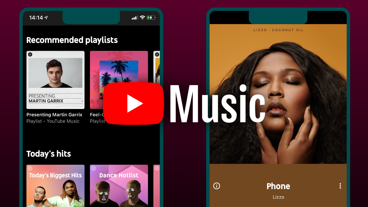
After testing a new layout for a select few users last August, YouTube Music is now rolling out the new in app interface for everyone. The card is the most affected Collection.
Before this major update, the layout of YouTube Music had remained almost unchanged since the 2018 release. The buttons remain basically three: Home, Explore (which used to be called I Successi del Momento) e Collection. The latter, with the new update, will appear more intuitive, immediately showing the contents of your library.
What changes with the new layout of the YouTube Music app
With the new layout, reports 9to5google, you can now filter content by quickly switching between Library, Downloads, Uploads and Device Files. Also, to quickly access this collection, just double-tap the bottom bar.
Another novelty concerns the history section, which is now located at the top, next to the Cast icon. To consult the songs listened to recently, it is therefore no longer necessary to access the Account section. Finally, this section features a drop-down menu that now allows you to sort your history by: recent activities, recently added and recently played, from A to Z (or Z to A).
The new layout is part of the latest app update, already released today in the US for Android and iOS users. So make sure you have the YouTube Music app updated to the latest version to benefit from the new interface.